INSIGHT
See the World in Color or Black & White
COLOR THEORY
A WORLD IN COLOR, A WORLD IN BLACK & WHITE
No one can deny that color informs myriad aspect of our lives: practically it supports orientation and identification of threats, psychologically it informs our emotions and reactions, and metaphorically it drives symbolism. It has the power to lift and break our spirits. Color creates the present, helps us remember the past, and allows us to imagine the future. It’s impossible to ignore it, and we will be forever bound to it.
However when photography first appeared it was in black & white – color was technologically impossible. And while some photographers did their best to put color into photography as soon as the means became available, others saw an opportunity. No one had seen the world in black & white in such detail before, and to their surprise the world was magical in this medium too. For some, it was even more profound than the one in color. And so although color photography has been available to the public since the late 1930s, many photographers argue that the black & white aesthetic suits the art of photography better.
Our Colors and Black & White competitions invite photographers to focus on one aesthetic or the other. Leave aside the subject matter for a moment and put all your energy into decomposing the frame into its visual elements. Follow the lines, immerse in the textures, take in the shapes, and let color or the lack of it speak. These two competitions emphasize the harmony of photography, the balance of elements, the rhythm and dynamics of composition. They are not about a particular subject matter because both color and black & white aesthetic have their strengths and can benefit all photographic genres. So, close your eyes and imagine the world in both color and in black & white.
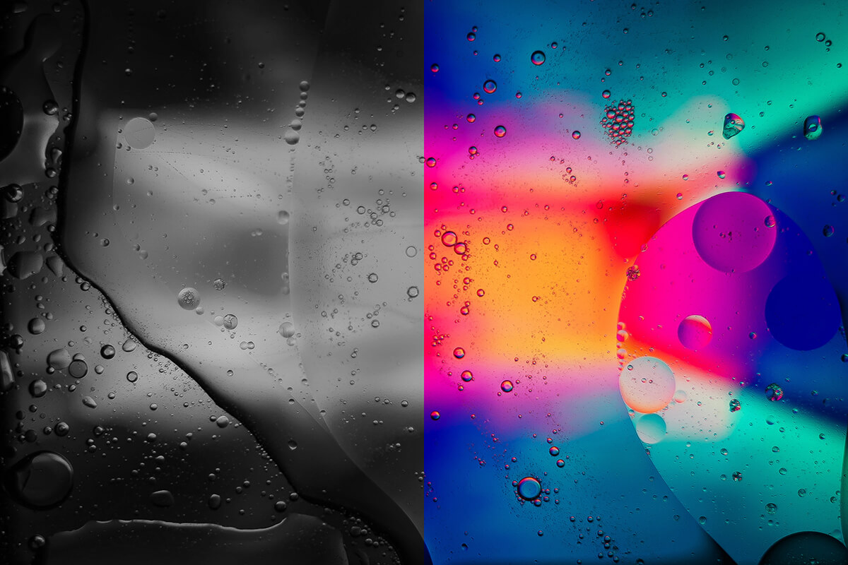
Banner image © Julian Hochgesang on Unsplash
COLOR VS. BLACK & WHITE IN NATURE PHOTOGRAPHY
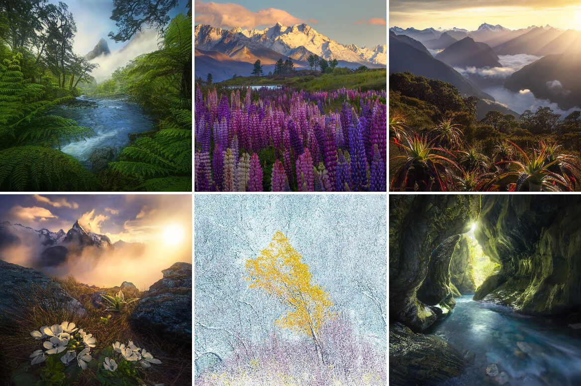
Images © Marc Adamus from his Instagram grid. See more at www.marcadamus.com and @marcadamus
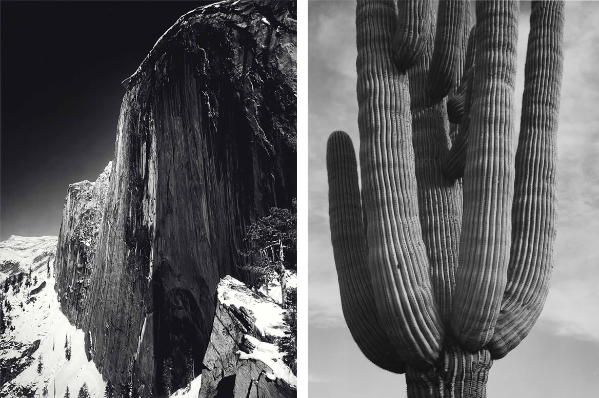
Images © Ansel Adams. Left: Monolith, the Face of Half Dome, Yosemite National Park, California, Right: Detail of cactus “Saguaros, Saguro National Monument,” Arizona. See more at www.anseladams.com
Color is one of nature’s greatest gifts. And although technology does its best to reproduce natural colors, we are still far from achieving them. But color may be all you need to create an impressive and memorable image of the natural world – it can provide a temporal dimension, localization, weather forecast, and cultural details. It enhances the visual story with both facts and an atmosphere. Color conveys feelings and emotions and allows you to put a powerful message into your photographs, be it environmental awareness, mindfulness or nostalgia… It’s also an amazing focal point and contrast creator, so framing becomes easier.
It may seem counterintuitive to take color out of a nature photography composition. However in the absence of color, as we know the human eye focuses on lines, shapes and textures. The viewer perceives the full strength and fragility of our planet, understands the fluidity of everything that surrounds us, and becomes part of the scenery. Black & white in nature photography reveals the essence and raises awareness.
Like Ansel Adams (1902 – 1984) once said, “There is nothing worse than a sharp image of a fuzzy concept.” By using black & white in nature photography you focus on the concept. Renowned for his iconic landscape photographs and conservationist beliefs, Adams was an advocate of pure fine-art photography and preferred the black & white aesthetic. He took only around 3,500 photos in color, the rest of his portfolio being black & white landscape photographs.
COLOR VS. BLACK & WHITE IN PORTRAIT PHOTOGRAPHY
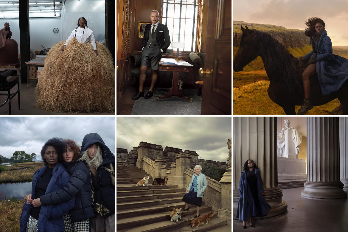
Images © Annie Leibovitz from her Instagram grid. See more at @annieleibovitz
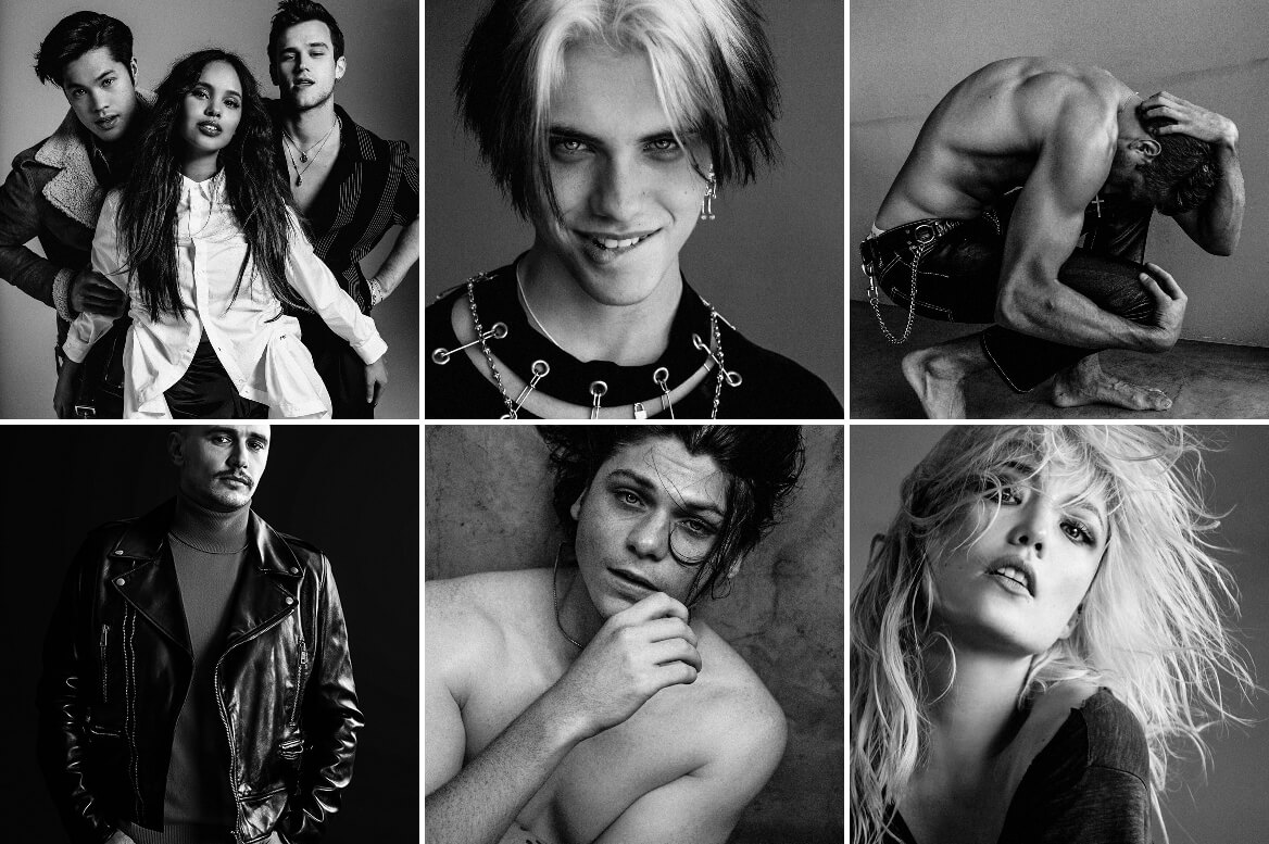
Images © Damon Baker from his Instagram grid. See more at @damon_baker
As with other genres, including color in portraiture allows the photographer to capture reality as it is. To reveal the features of your model and enrich the story with details of race, status, personality, fashion style, mood, and so on. The power of color in portraiture is the ability to create a dialogue between the viewer and model. You put them face to face and let them talk.
When you take color out of the equation, portraits dig deep into the model’s personality. They become more about the interior than the exterior. Black & white portraits smooth facial features and hide the color of clothing. The focal point shatters into pieces, and the viewer feels the need to spend more time with the photograph. Eye contact becomes imperative. In its absence, the viewer perceives drama and powerful emotions. Black & white portraits aren’t face-to-face dialogue anymore. They may be anything, from monologues to arguments to theatrical acts.
COLOR VS. BLACK & WHITE IN CANDID PHOTOGRAPHY
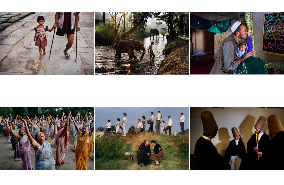
Images © Steve McCurry from his Instagram grid. See more at www.stevemccurry.com and @stevemccurryofficial
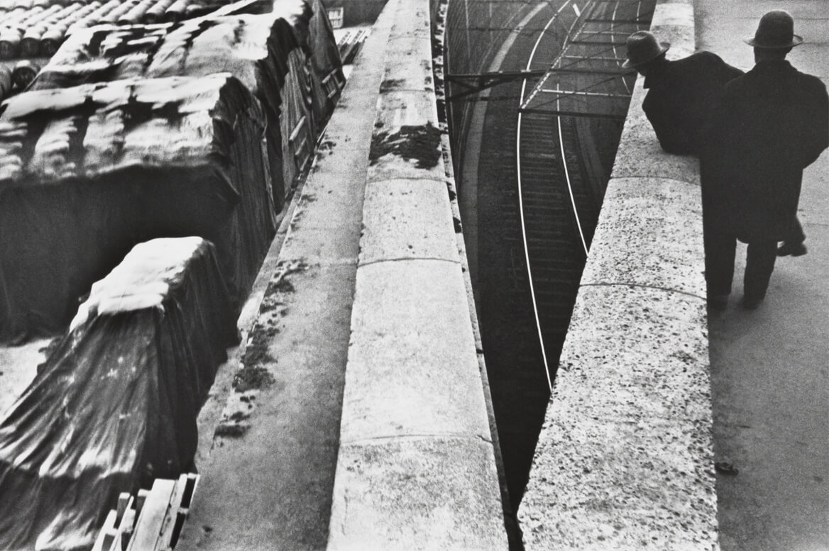
Image © Henri Cartier-Bresson. The Quai St Bernard, near the Gare d’Austerlitz, Paris. /p>
The choice between color and black & white aesthetics when taking snapshots speaks a lot about the photographer and their artistic and life philosophy. Color candid photographs start at the surface and then go deeper, layer by layer. It is often the color that captures the viewer’s attention and guides them through the frame. Color is the big signal that tells you where to look. At the same time, color localizes candid photographs in time, space and culture.
Black & white candid photographs, on the other hand, start directly at an emotional level. The viewer may or may not register the outer layers. But they will certainly register the emotion conveyed by the photograph, the drama of the captured moment, and the implications for everyone involved in the story. Black & white aesthetics provide a simplified version of reality, intending to reveal the essential. Like Henri Cartier-Bresson (1908 – 2004) once said, “Reality offers us such wealth that we must cut some of it out on the spot, simplify. The question is, do we always cut out what we should?”
COLOR VS. BLACK & WHITE IN COMMERCIAL PHOTOGRAPHY
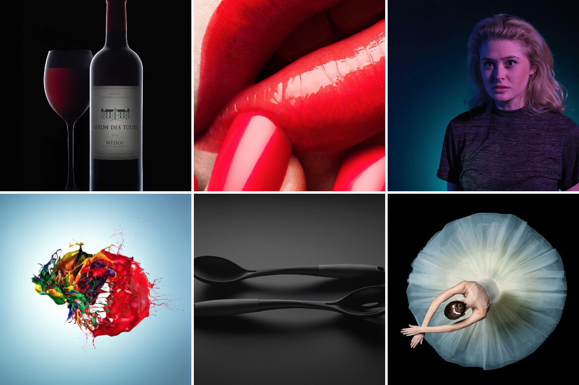
Images © Karl Taylor from his Instagram grid. See more at www.karltaylor.com and @karltaylorphotography
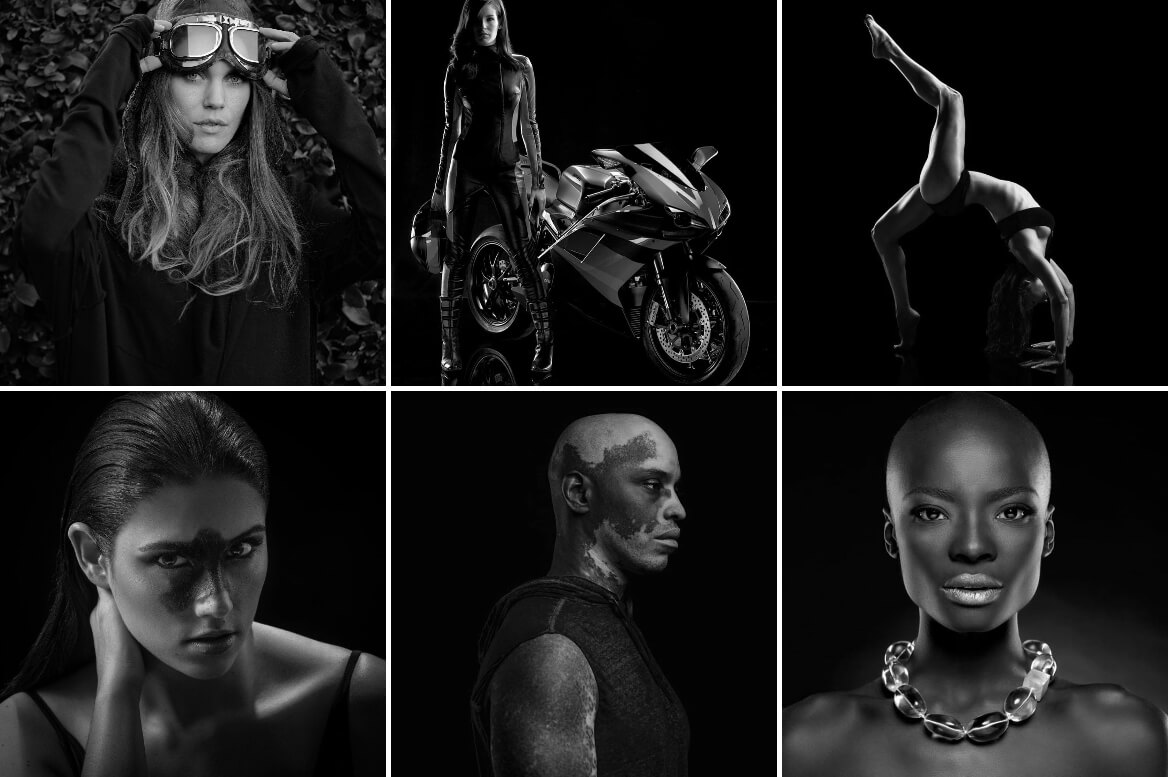
Images © Casar Lima from his Instagram grid. See more at www.caesarlima.com and @caephoto
Color and black & white aesthetics make different characteristics of an object stand out. As commercial photography is all about promoting an item, the photographer will choose the aesthetic that flatters the item and makes it appealing to the public. For example, beauty editorials may use color photographs when targeting make-up products and black & white photographs when targeting skin products.
Commercial photography also promotes lifestyles and attitudes and targets a particular audience. Therefore, the aesthetic of the photographs will match the audience’s expectations, cultural preferences and trends. If the editorial emphasizes the longevity and legacy of a brand, black & white photography may be a better choice as it conveys stability, trust, and honesty. On the other hand, if the intention is to convey exuberance, freshness or being part of a community or culture, color photography provides all the required elements to fulfil the brief.
Created with ❤️🧡💛💚💙💜🖤🤍
Words by Monica Radulescu
Photography © the author.