INSPIRATION
A Splash of Color in an Increasingly Grey World
INSPIRATIONAL COLOR PHOTOGRAPHY
Pushing the boundaries of color photography
The story of color in photography is a fascinating one. Originally seen as crass and unsophisticated by the black-and-white-shooting elite, perceptions slowly changed thanks to the work of a few brave and hardy pioneers, pushing against the trend of the time. Nowadays, many photographers work in color by default rather than design – the decision to shoot in black and white is a conscious one, and if it hasn’t been made then color is the knock-on result. It’s therefore striking when a contemporary photographer puts color at the heart of their work – using it in creative ways, or as an central part of the messages they’re trying to put across.
This list explores a few of our favourite photographers who pushed or are pushing color photography in interesting, unprecedented directions. Of course some likely candidates are missing – Alex Webb, Saul Leiter, Helen Levitt, Constantine Manos, Joel Meyerowitz, Ernst Haas and Stephen Shore to name a few – but the list isn’t meant to be exhaustive and I’ve aimed to choose a few lesser cited photographers as well as those most commonly mentioned. We hope you find a wealth of inspiration among these names.
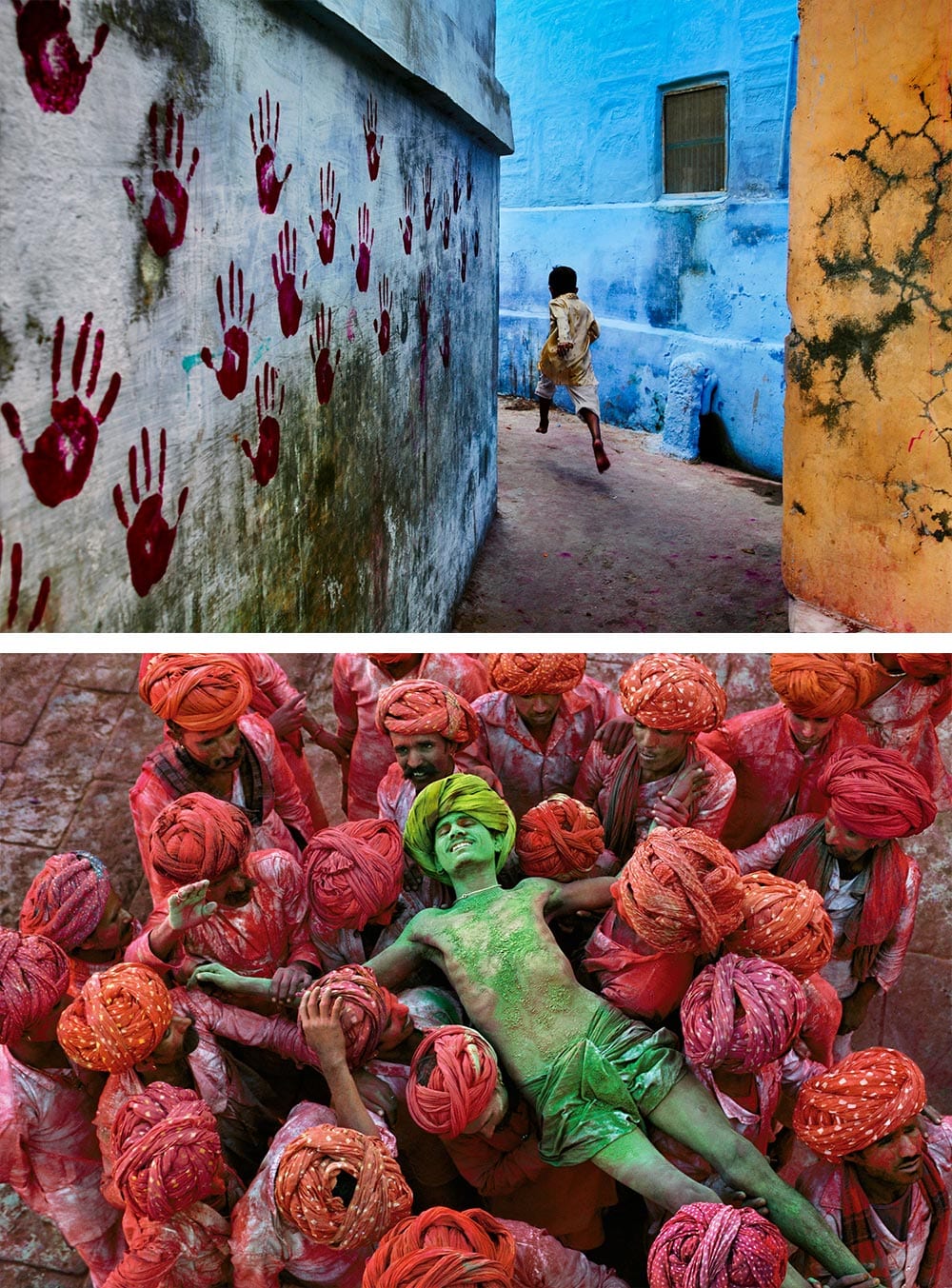
Fan Ho (1931, China)
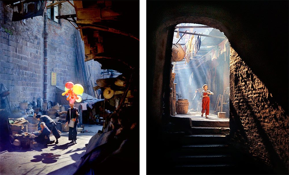
Images © Fan Ho
My first choice is the celebrated Chinese photographer Fan Ho (or Ho Fan, depending on where you’re from), who sadly died earlier this year. Even if unfamiliar with his name, you’ll probably recognise his work – his black and white images of Hong Kong, documenting the rapid modernisation in the 1950s and 60s, have become somewhat iconic.
He described the streets as the ‘living theatre’ but his talent was in distilling down the hustle and bustle into simple, elegant compositions. Working as a film director and actor alongside his photography, he had a keen eye for the cinematic, and his sophisticated use of light, shadow, depth and perspective combined to create some magical images that feel fresh and modern even now. ‘Approaching Shadow’ is perhaps the most feted and emblematic image of his unique style – it’s a wonderful shot.
It was only recently that I stumbled upon his rarer color images, and they left a powerful mark on me. Exhibiting his same masterful style, the addition of color brings out something new in those Hong Kong streets, filling them with energy and life. He picks out bright patchwork of colors in shadowed alleyways, lit by the warming glow of morning light. They’re so vivid and vibrant you can almost hear the chatter and taste the dust.
William Eggleston (1939, United States)
Images © William Eggleston
No list would be complete without William Eggleston, referred to by some as the ‘Godfather of Color’ and a pivotal figure in helping turn color photography into a legitimate artistic medium. He first started experimenting with color negative film in the mid-1960s – something that until then had been seen as crass and clichéd, more the medium of the advertising world than a serious artist. He slowly changed that perception, and yet like all pioneers had his fair share of detractors – one critic scathingly described his 1976 MoMA retrospective as “perfectly bad, perhaps… perfectly boring, certainly”.
For me, to fully appreciate Eggleston’s photographs, you have to understand the world in which he created them. Photography at the time was seen as an art form that needed a subject matter, a message, a story – neatly framed for the viewer to digest. His work turned that notion on its head – his subjects were mundane and barely subjects at all, often set at uncustomary angles, with no hint of an idiosyncratic character, or a ‘decisive moment’ for which Cartier-Bresson was busy making his name. He framed the banal, and found beauty in it, celebrating the ordinary through his fascinating color combinations and ‘magic hour lighting’. You need to slow yourself down when you look at his work – taking notice of the form and tight framing, the color combinations and how they play against the shadows. His talent slowly reveals itself in each of his images.
Eggleston was a ‘democratic photographer’ paving the way for eccentrics like Martin Parr and Nan Goldin. While most photographers were busy with the rigour of black and white photography, Eggleston truly saw in color.
See also: Stephen Shore, Joel Meyerowitz
Mona Kuhn (1941, Germany)
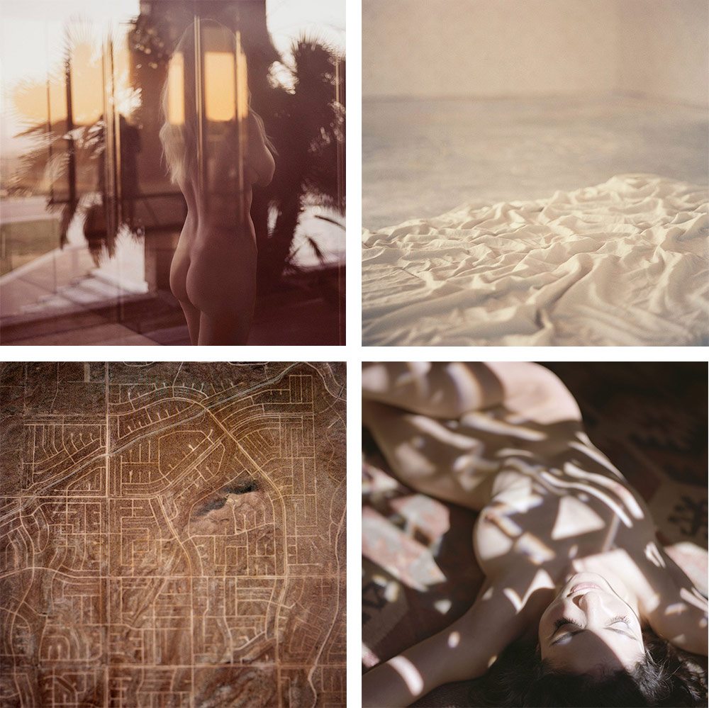
Images © Mona Kuhn
We were lucky enough to have Mona as our first judge for this edition of Life Framer. We interviewed her at the time, and her response when questioned on her creative process has stuck with me:
“I always start a new series quite simply by imaging colors first. Once I have a palette in mind, I then start creating a vocabulary around it. My creative process is mostly intuitive. I am quite comfortable in letting my curiosity guide me. I prefer to tap into what I don’t know, and go from there. Photography has always worked for me as a form of visual poetry”.
It’s quite an unusual approach when you think about it. Many photographers work with the colors they have, and others choose colors to match the mood or message they’re trying to convey, but few actually start with the colors.
It’s an approach that works beautifully. As a viewer I’m always struck by the gorgeous, soft tones of her images, before absorbing the models and their surroundings. Her gift, in my view, is the way in which she can elegantly balance color, composition, object and texture, resulting in images you feel as much as you view.
Steve McCurry (1950, United States)
Images © Steve McCurry
Like Eggleston, I can hardly claim that McCurry is an outsider choice – in fact he’s probably one of the first names that most photography fans would think of when asked about color.
Ultimately though, I couldn’t avoid including him. Not only do his images take us to some of the most incredible places around the world, but he has an almost unrivalled understanding of color theory. Once you understand the basic of complimentary and analogous colors, you can start to understand the psychology behind why his images resonate so spectacularly.
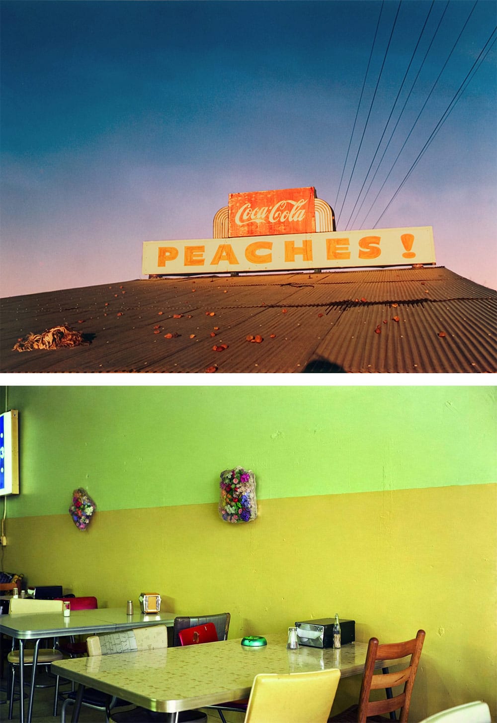
Martin Parr (1952, UK)
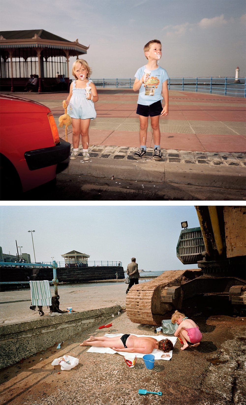
Images © Martin Parr
Like many, I love Martin Parr’s idiosyncratic, satirical style – his penchant for the gently humorous, and his eye for capturing the oddities of modern life.
His first color publication ‘The Last Resort’ documented the working class people of Britain on their seaside holidays, and like Eggleston, it was met with derision by many art critics. They attacked his images for being unflattering and condescending accounts of these holiday-makers at tatty and dilapidated seaside resorts, describing them as vulgar and sanctimonious.
As with Eggleston, time has been kind to ‘The Last Resort’ and it is now held up as one of the most important socio-economic accounts of its time, and a significant lever in changing the perception of what documentary photography could be.
What stands out the most for me though, is his color aesthetic. Most images of Britain in the 1980s, under Margaret Thatcher’s steely rule, are grey and gloomy, sad and dull, to the point where it’s difficult to imagine a country that wasn’t depressingly dreary and overcast all the time. And yet his images pop with vibrant color. They show a country that was bright and cheerful despite the economic hardship, and they run completely against the grain of what others were documenting in parallel. His medium-format images are filled with character and charm, and in fact now exude a fondness, rather than harshness, for that time.
Miles Aldridge (1964, UK)
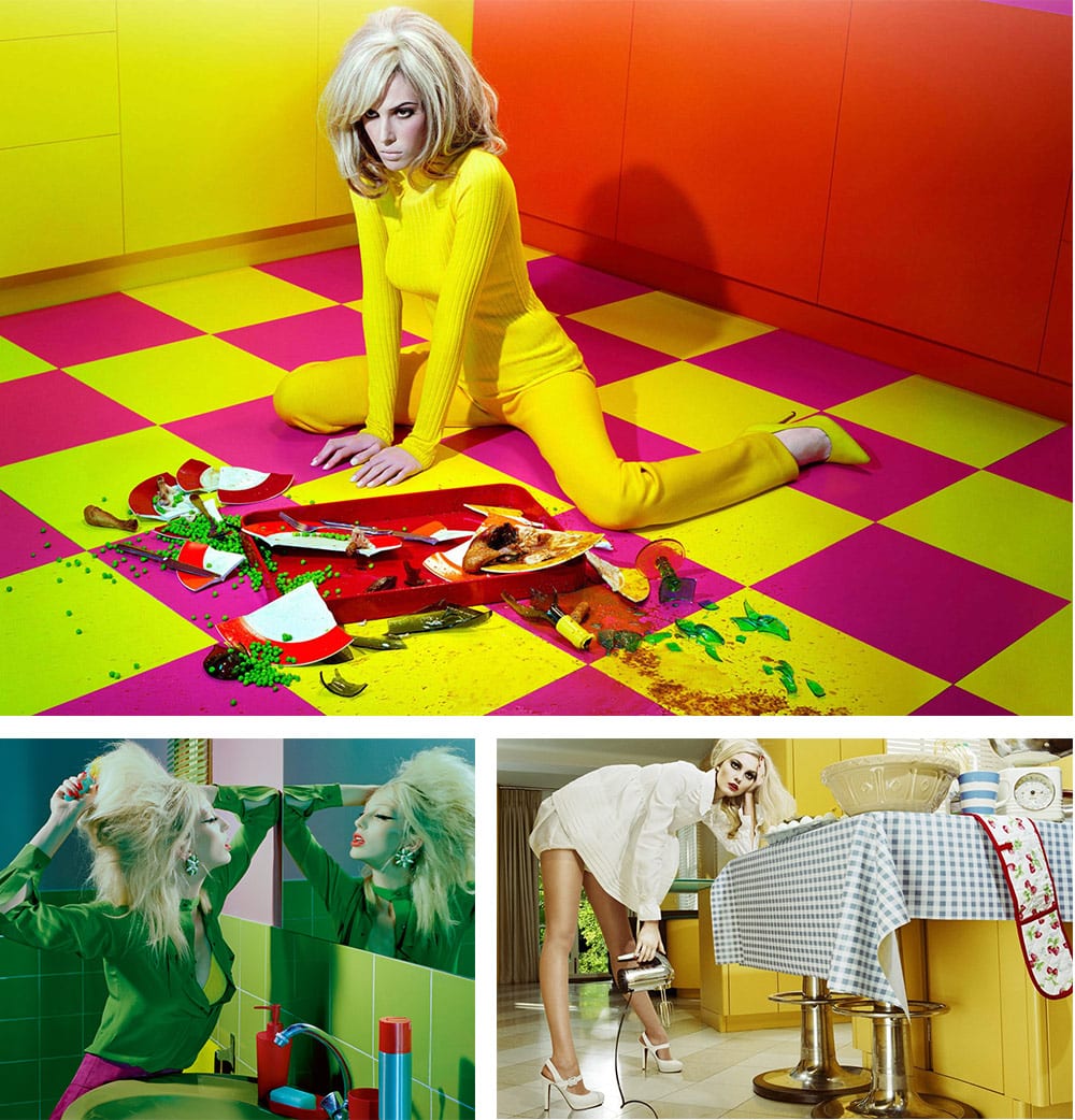
Images © Miles Aldridge
“Miles sees a color coordinated, graphically pure, hard-edged reality”. — David Lynch
Flick through a few of Aldridge’s images, and it’s not hard to decipher his twin obsessions – women and color.
He creates lurid, technicolor worlds and populates them with glamorous, beautiful women. His vivid, psychedelic tones however belie a dark undercurrent to his work. The lurid colors create a world that’s just too perfect to quite believe, and the women’s vacant stares echo that, building a sense of disturbance and neurosis. Like the world inhabited by the Stepford Wives, all is not quite what it seems.
For me, the power of his images is the way in which he subverts the world of fashion photography and advertising. He takes that industry, that world of flawless, happy people with their perfect lives and perfect products, and calls them out on it. He plays with the idea that perfection leads to insanity, and his use of candy colors is absolutely central to that.
See also: David LaChapelle, Alex Prager
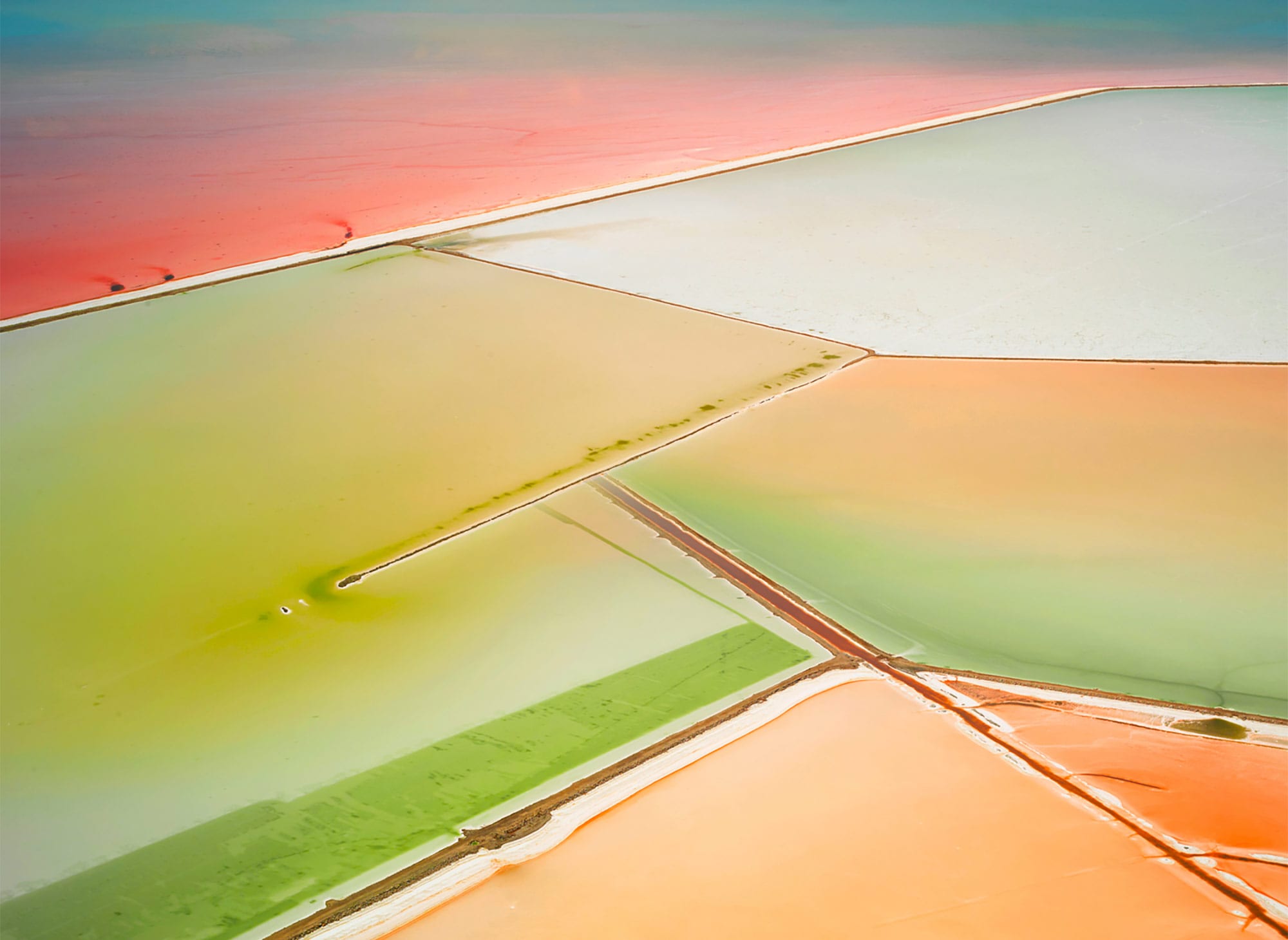
David Burdeny (1968, Canada)
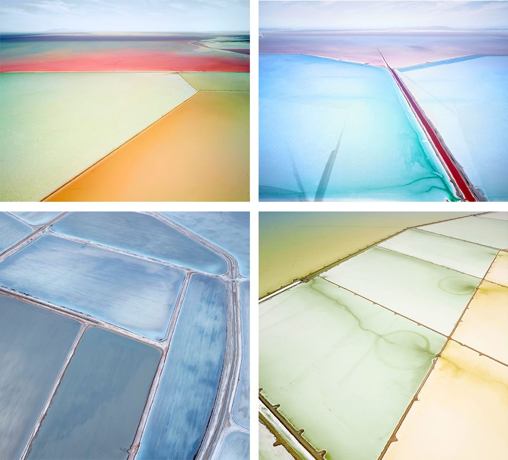
Images © David Burdeny
David Burdeny is a largely self-taught fine art photographer, with a penchant for simple and exacting documents of our vast world, and the marks that we as humankind leave on it.
He’s known for his precise and deliberate color palettes – his series ‘NORTH AMERICA’ is pure turquoise and faded grey, ‘EUROPE’ is dusty yellow and dirty cream – but it’s his technicolor series ‘SALT: Plottings and Extracts’ that shows, in my opinion, his most stunning use of color.
Using precision options, unusually long exposures, and a myriad of other mysterious techniques, he photographs the Great Salt Lake of Utah by helicopter, capturing and enhancing the unreal (but natural) colors. He says of them:
“They’re the result of algae in the saline water and as they pump one to another the colors tend to mix, change and dilute like a giant earthbound water-color painting.”
And he’s right – his images have something of the painterly expressiveness of Mark Rothko or late career Willem de Kooning. And yet what I think works, is that he doesn’t reduce the scenes into abstract shapes and colors. Keeping the horizon in frame, we remain connected to them, seeing something that we recognise from Google Maps, but that registers with us on an entirely different plane. In our hyper-connected world, they slow us down with their softness, quiet emptiness, and gorgeous color palettes.
Richard Mosse (1980, Republic of Ireland)
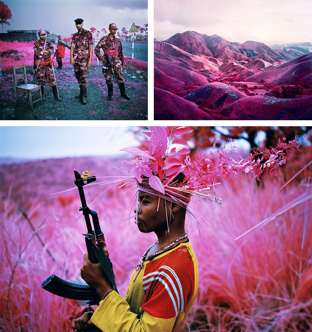
Images © Richard Mosse
Mosse rose to recognition with his reportage of the war in the Democratic Republic of Congo. Like many war photographers, his images are raw and unflinching, but unlike others, he employs a wonderfully distinctive visual technique, painting his subjects and landscapes in vivid pinks and crimsons, and in doing so blurring the lines between documentary and art.
The secret is a medium-format camera, and the now-discontinued Kodak Aerochrome film. Originally designed for aerial vegetation surveys and for military reconnaissance (for example in the identification of camouflaged targets) it registers a spectrum of infrared light invisible to the human eye, rendering the green landscape and soldiers’ uniforms in intense reds and pinks.
The images are visually arresting, but the false color film is more than just a surreal aesthetic trick. By painting war in a color associated with love and femininity, he highlights the absurdity of the fighting. It’s one of the rare examples I can think of where the message truly is in the medium.
So brilliant is Mosse’s work, I wait expectantly to see how he will go about following it up.