INSPIRATION
Color and the Vibrancy of Life
INSPIRATIONAL COLOR PHOTOGRAPHY
Color as a Protagonist
Photography writer Francesco Scalici (follow him on Instagram here) shares his favorite photographers working across a range of genres and subject matters, but all with a masterful control of color…
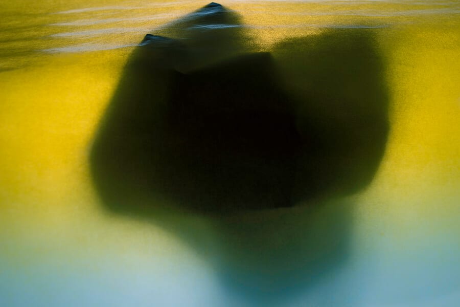
Banner image © Mariëlle Gebben
It’s easy to suggest that photographing something in color doesn’t take much effort. It’s now the ‘default’ for most image-makers, and our exposure to color photography is so frequent that it has become increasingly hard to bring to the fore photographers who work with color in a deliberate, personal and dynamic way. However, the saturation of imagery today has also allowed us to become more self-critical about color photography. It permits us to really scrutinize exceptional bodies of work and bring to light photographers whose images are more than just composition, lighting and structure, but rather live and breathe color.
Remembering the first time I resonated with a photograph that focused on color made me re-think the very structure of my own imagery. Color photography has the power to create different levels of depth which traditional black and white does not. While black and white acts to abstract a scene, color can make it hyper-real.
The following list brings to light contemporary photographers working in this field whose works demonstrate excellence in color – Photographs who, in my opinion, achieve a level of uniformity in structure, framing, subject matter with color as the main protagonist.
Prashanta Hridoy
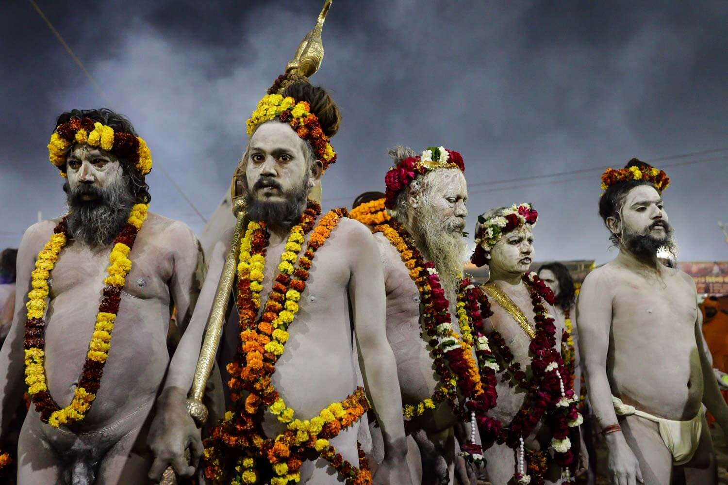
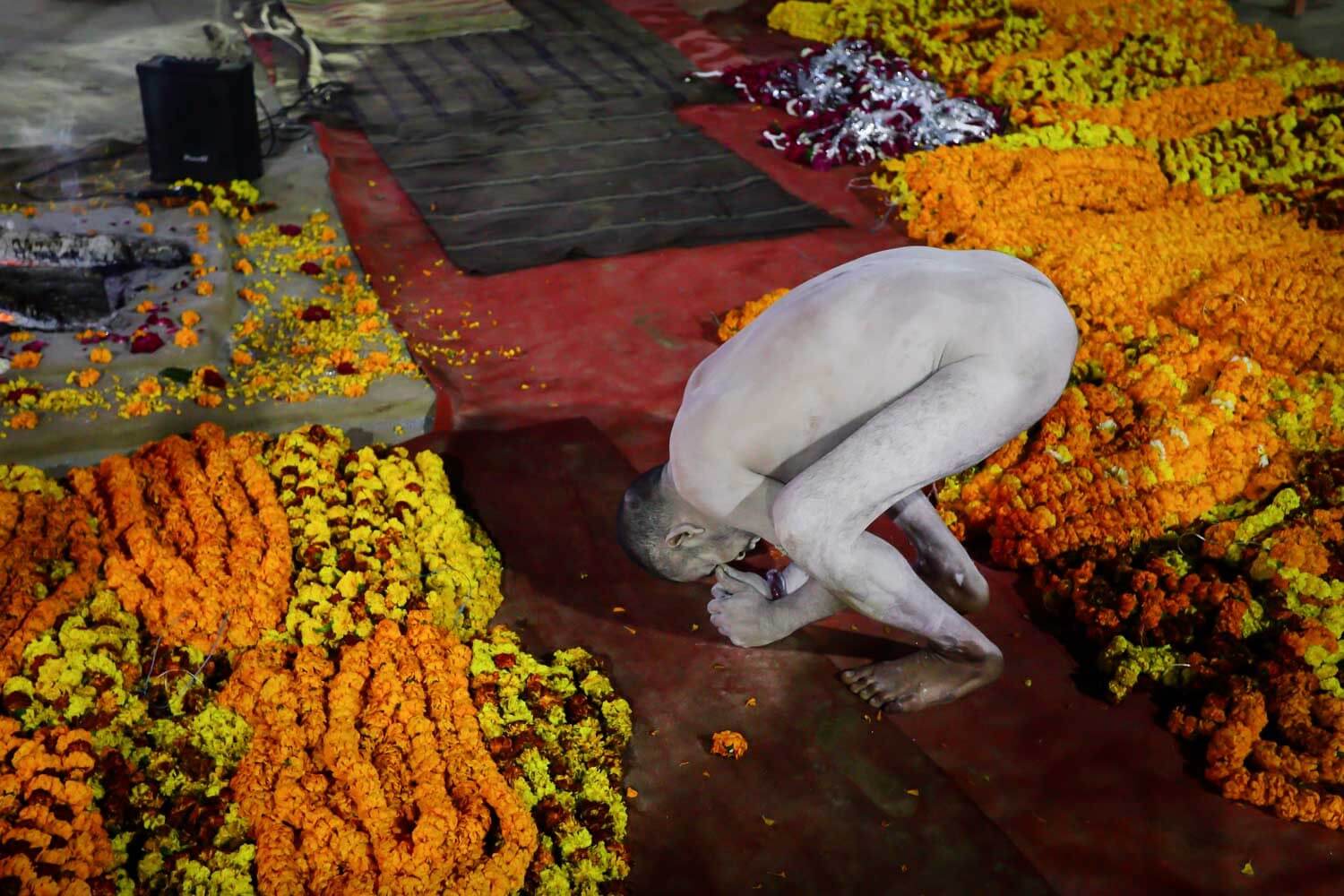
Images © Prashanta Hridoy
Prashanta Hridoy’s most recent body of work ‘The Sacred Fair’ details his encounter at the ‘Kumbh Mela’ peace gathering in India – a gathering point for all pillars of Indian spirituality to embrace the search for truth. Prashanta’s photographic quest is reflective of that same spiritual journey, as he attempts to capture the diversity of humanity’s devotion to this sacred place. The documentary style is an important structure throughout this series, yet it is the variations of warm yellows, oranges, reds and whites which characterize his subjects. I am vaguely reminded of Steve McCurry’s work and his emphasis on color and composition. But where McCurry’s images seem more refined and centre around very specific subjects, Prashanata’s work aims to present the significance of his subjects in relation to prayer or meditation, using color as a guide in order to isolate his subjects’ actions and movement.
It balances beautifully a documentary style with an emphasis on the vibrancy of life. His imagery is less focused on understanding the symbolism behind this gathering and more on the community of people that choose to be there. The colors which emerge from each photograph are a denouement of his interactions with such unique individuals.
Peter Fraser
Images © Peter Fraser
Peter Fraser’s interest in subject matter is rather unique – he seems to detail an admiration of objects, those lost or forgotten, as he attempts to find composition and balance with each one. Color in this instance provides his objects with character and in many cases a comedic value. What differentiates his use of color from others is saturation. The structure of his photographs can be compared to that of a product photographer, but while a photographer in this field may seek to glorify, Fraser attempts to isolate very specific portions of his subject and condense their overall appearance. The result is a somewhat candid description of a tool, highlighting its imperfections and qualities that might have previously been overlooked.
Taking the series ‘Mathematics’, it is still unclear to me if his work signifies personal importance towards different objects, or if his work is purely about composition, aesthetics and color. I would like to think that his work is symbolic (to some degree) and that some images suggest a greater level of depth. Yet I feel as if Fraser is attempting to let go of this, the outcome of which is to present photographs that should be taken at face value, what you see is essentially what you get!
Gianluca Attoli
Images © Gianluca Attoli
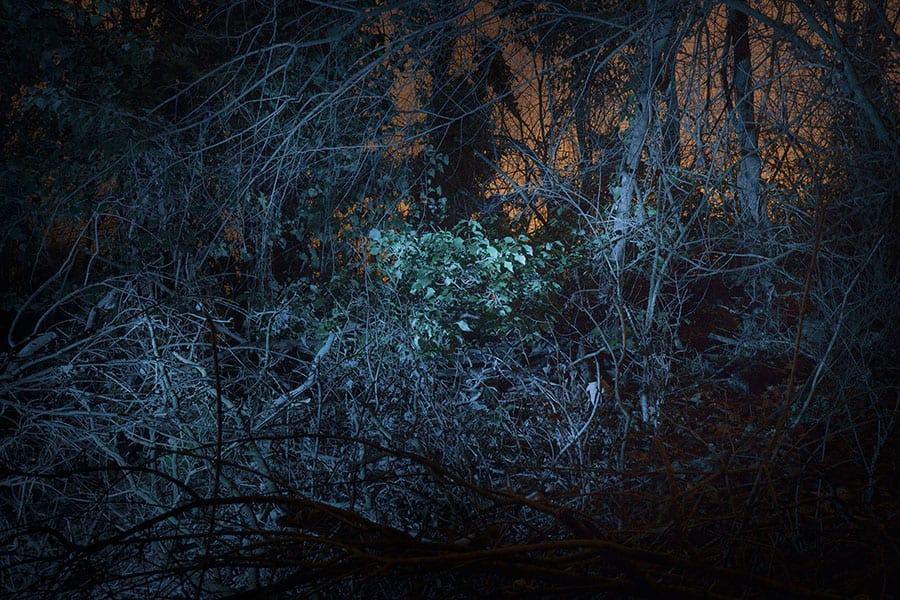
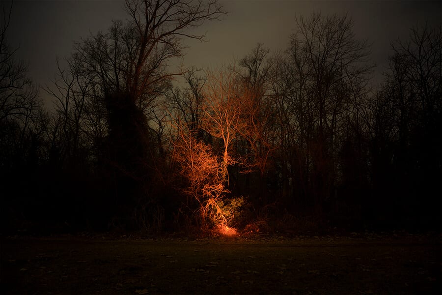
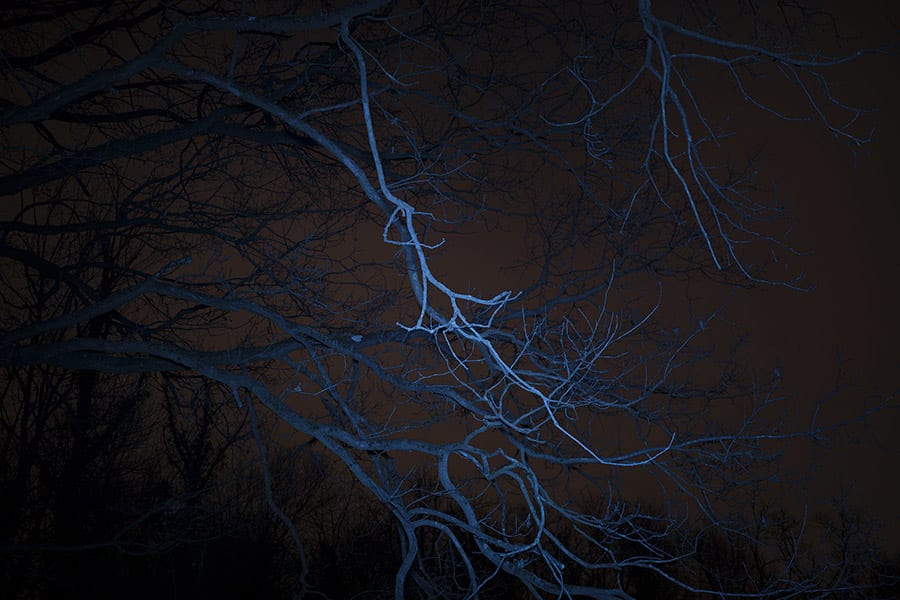
“Just as in crime movies the forensic technicians arrive on the “crime scene”, shut the lights down and enlighten the scene with UV lights to let stains and traces sparkle in the dark, thus letting the latent truth of a certain event emerge for a moment”.
Attoli’s series ‘Sparks’ presents a rather personal approach to color, and specifically the relationship between color and nature. His direction for this project was very clear – to explore the traces of human affection and the residuals of life encrusted in places. An investigation of the past and present, this collection of images aims to showcase a play on reality and imagination. His enthusiasm of the ‘UV’ light grounded his experiments with nature as many of these images seem surreal, as if pulled from a moment in time, evoking feeling of suspense, terror and apprehensiveness.
Color in this instance is a part of Attoli’s showmanship, in order to evoke these feelings and dramatize the environment around him. The images suggest a harshness in nature, as many of the branches and trees which have been lit up are reminiscent of the energy and power of lightning.
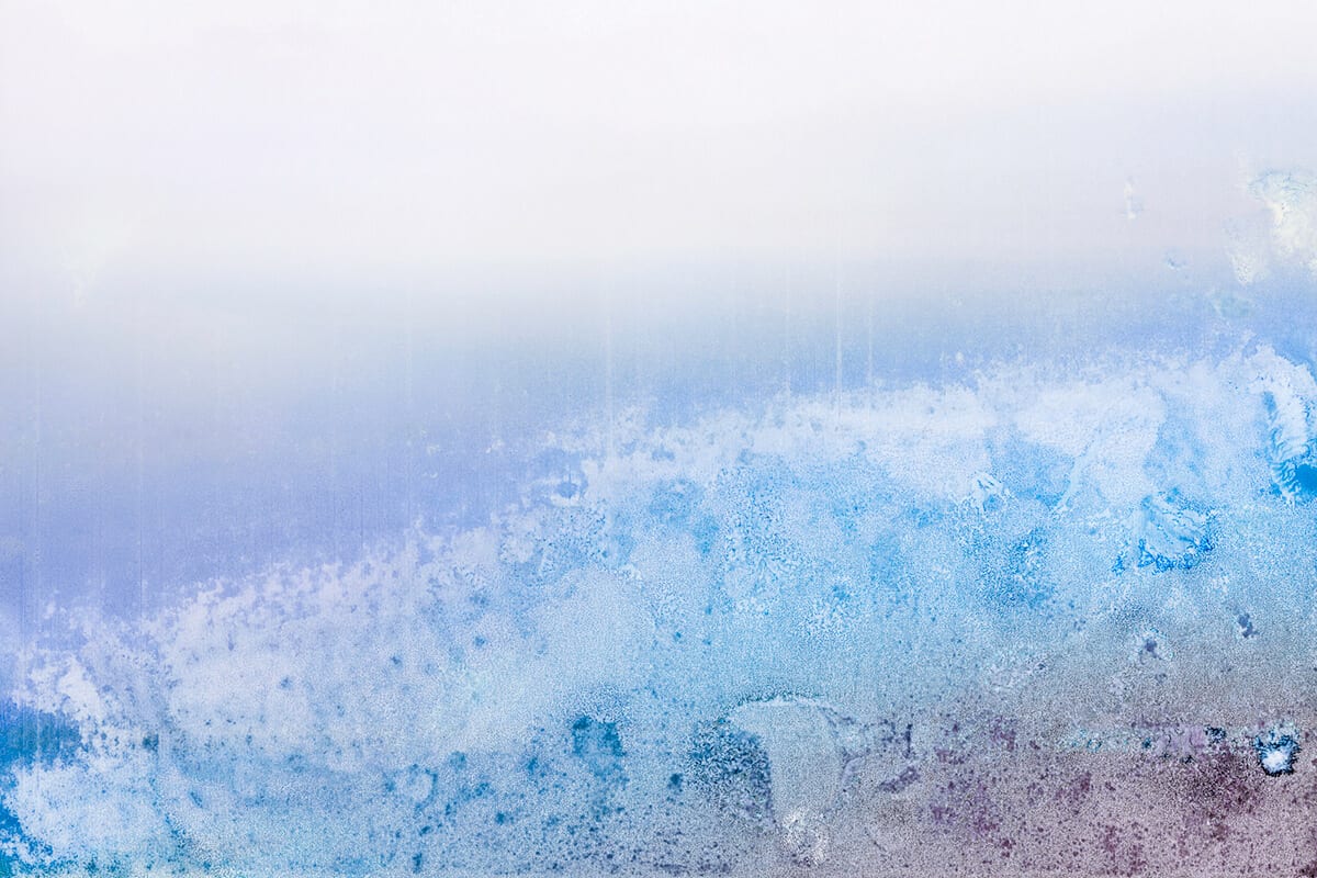
Mariëlle Gebben
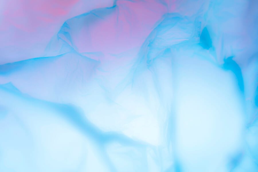
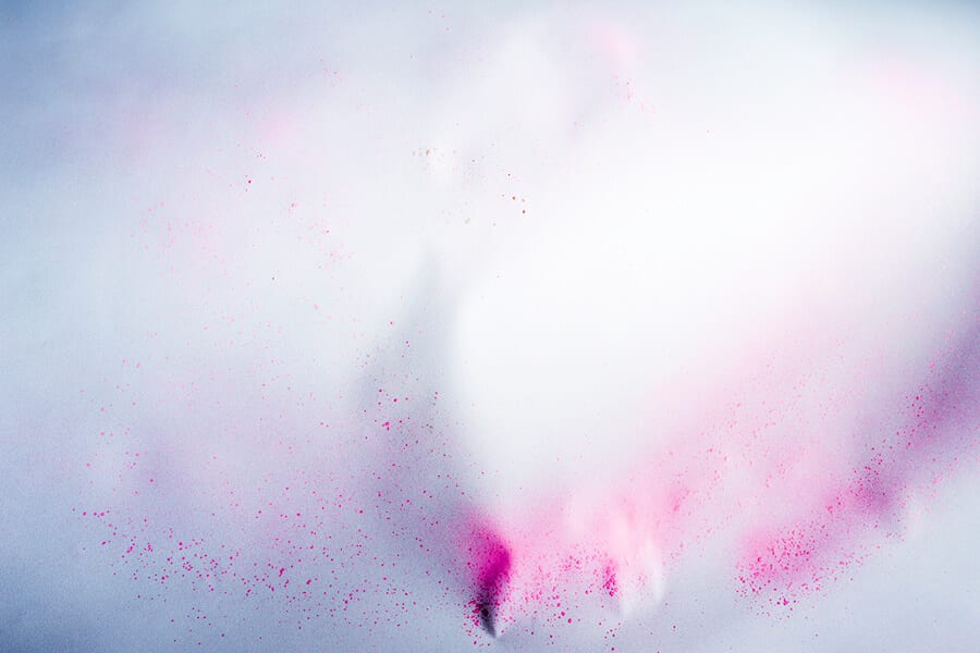
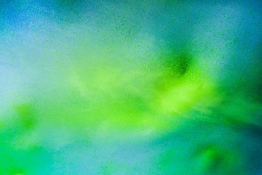
Images © Mariëlle Gebben
Pushing the boundaries of color photography can sometimes lead to remarkable bodies of work. Mariëlle Gebben’s latest series ‘Rabbit’, is in my opinion one of the most interesting forms of demonstrating an abstracted version of color. Throughout this series I was exposed to an “under the microscope” perspective, as many of Gebben’s photographs detail a consolidation of colors. The end result is photographs that bridge the gap between painting and photography, an exploration of purity in color and its relationship to material. And while Mariëlle’s work is somewhat personal I believe her photographs translate elements of peace and equanimity, aiming to submerge an audience into a trance. She states:
“My artworks are abstractions of an imaginary reality. I find inspiration in nature, astronomy and the story of creation”.
The notion that color photography breathes life and fulfillment is demonstrated beautifully throughout projects like ‘Rabbit’ and ‘The Wall House’. You could state that due to the fluidity of Gebben’s images there is a lack of structure and composition, however I believe in this case it’s the complete opposite. Gebben’s photographic work demonstrates a strong consideration of composition as colors seem to feed off each other and dance off the canvas. Playing with colors that oppose each other in subtle ways sometimes, and harshly at others, this project succeeds in drawing us closer to find combinations of materials used.
James Turrell
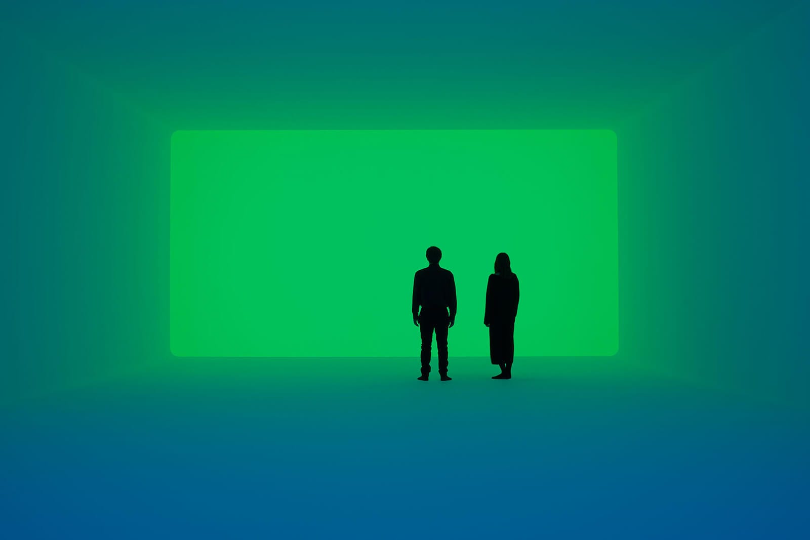
Image © James Turrell
“Ganzfeld: A German word to describe the phenomenon of the total loss of depth perception as in the experience of a white-out”.
At the very forefront of color manipulation is artist and photographer James Turrell. A very personal inclusion to this list, I find Turrell’s work to be a truly exceptional way of communicating the loss of depth perception through use of a singular color. One of the most respected artists in today’s contemporary art scene, his work has reached the likes of the Long Museum in Shanghai, and the Häusler Contemporary in Zurich, as well as the MoMA in New York.
‘Ganzfelds’, is a series detailing several large installation pieces showcasing the nature of one’s interaction with color. Allowing yourself to become immersed by the total loss of depth perception, this series aims to continue Turrell’s love of a relationship with a singular color and the application of it. He seeks to present color as something uncomplicated and raw, simultaneously detailing a sort of lucid state and creating feelings of peace and tranquility. Confronted with the idea that less is more when entering such a space, Turrell manages to entrance an audience with the sheer size of his work as the scope of each piece aims to pull you in.
“I’m also interested in the sense of presence of space; that is space where you feel a presence, almost an entity — that physical feeling and power that space can give.”
Pete Turner
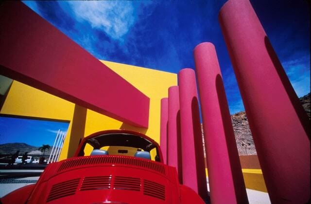
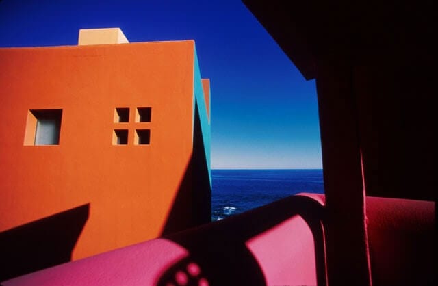
Images © Pete Turner
It’s incredible to see how many photographers who work with color can emphasize the richness of contrasting shades. Pete Turner is no exception, and his bold and heavy approach to color forms the main structure of his work. His ability to dissect fractions of a landscape with color leads to something surreal, reminiscent of the painter Salvador Dali and his application of color as bold and pronounced. This surreal state is further emphasized by the geometric structures which compose each image, resulting in a photograph that is both minimal in subject yet equally filled with a combination of lines, shapes and hues.
Pete Turner’s work – particularly that of his series ‘Walls of Light’ really does remind me of a sophisticated and refined version of a children’s coloring book. His subjects are not to be thought of as complex and with meaning, but as vehicles for color, pulling you in ever closer to the feeling of orange, red and blue. A pioneer of color photography, Turner has pushed the very boundaries of what color can mean and represent.