INTERVIEW
Fantastic Plastic?
WITH INGE PRINS
An interview with Inge Prins
“I imagine future archaeologists finding these intact plastic artefacts as clues about a lost civilisation that produced such a miraculous substance, in such vast quantities that it was considered disposable”.
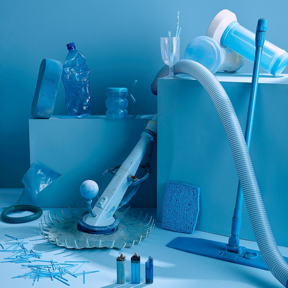
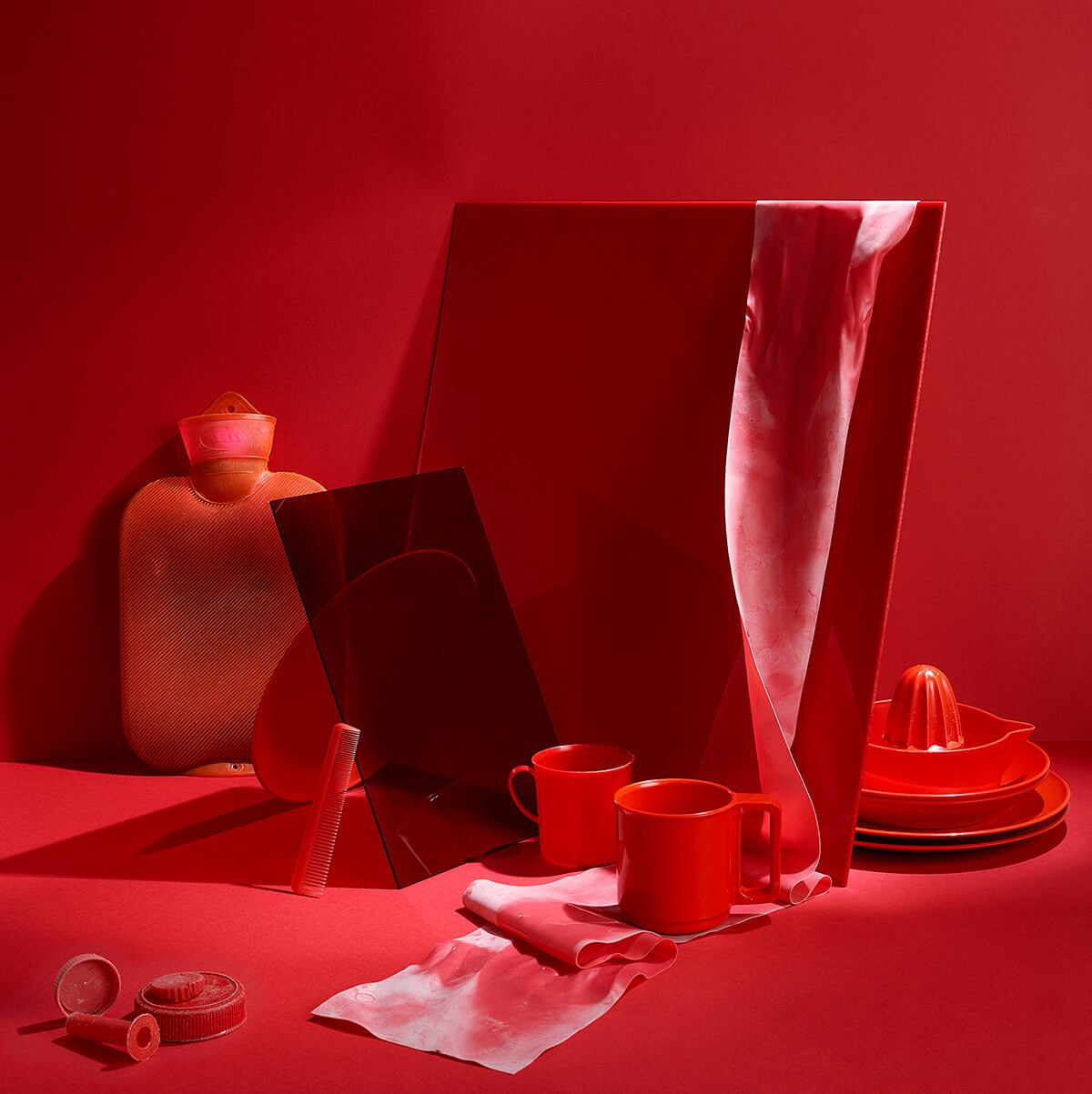
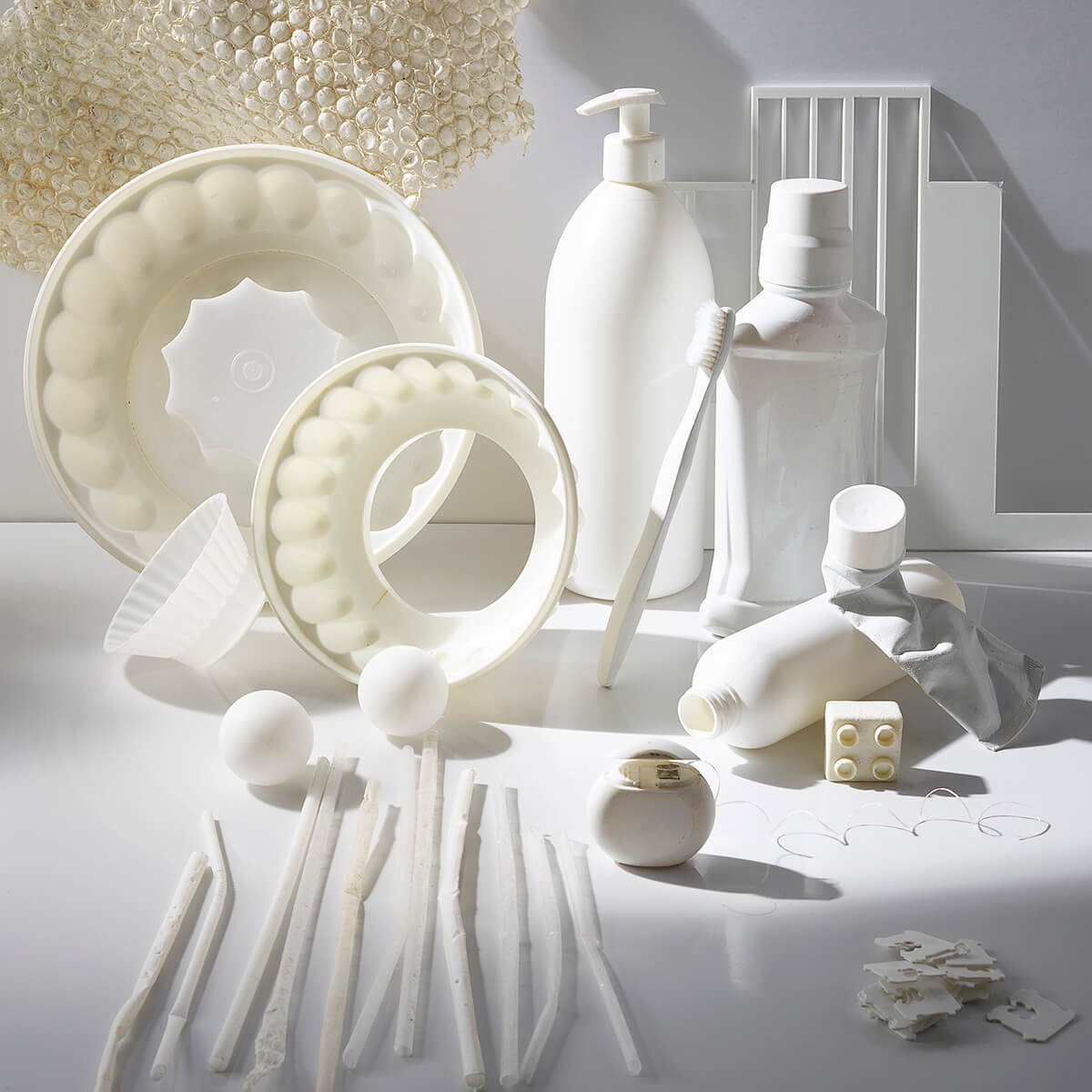
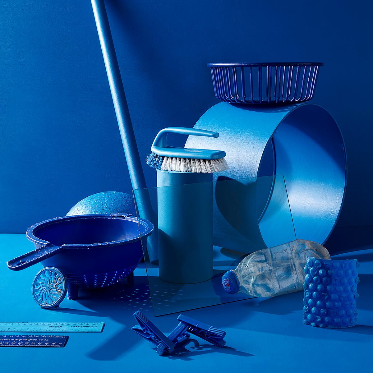
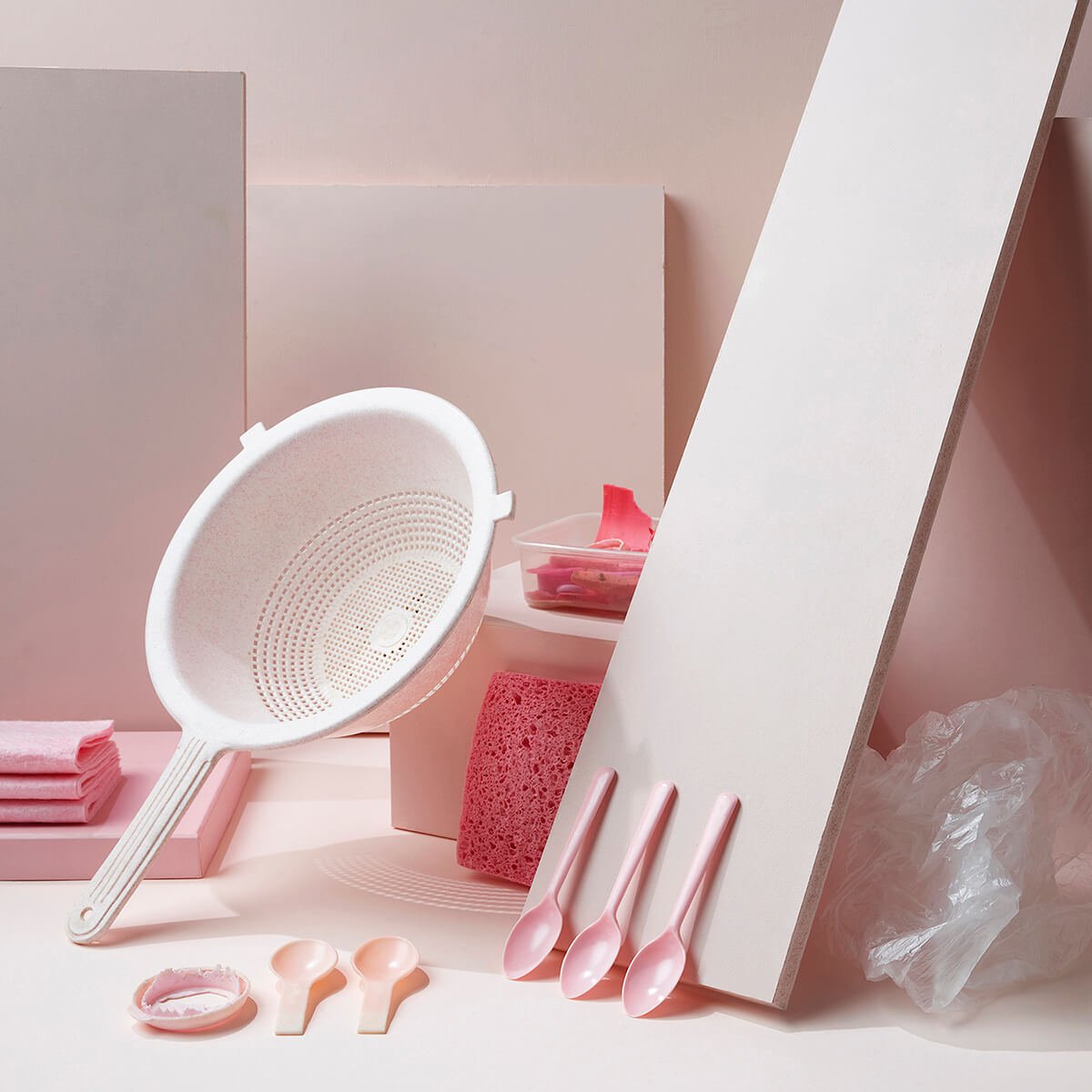
Inge Prins won our recent Colors theme with a stunning still life scene that challenges our perception of color, as well as our relationship with disposable goods. That image comes from her project “My Best Life” and so keen to know more, we put some questions to her…
Hi Inge. Congratulations on winning our Colors theme! Do you resonate with Richard Mosse and the Life Framer Editors’ comments (below)?
Thank you so much Life Framer. Yes! I was very happy to read Richard Mosse’s comments and to see that he understood the intention of my work. I am delighted that the Black image was chosen as the winner for the Colors theme as I feel passionate about the message of this series and this particular image expresses it clearly. I agree with Richard’s comment that we do not always pay enough attention to the opposites of color and light. Ignoring the dark side gives it power over us. As a species we stand to lose everything (all color) if we continue with our destructive habits.
The image comes from your series “My Best Life” in which you present a number of monochromatic scenes of discarded plastic items. Can you tell us a little bit about the concept behind the series, and how you went about executing it?
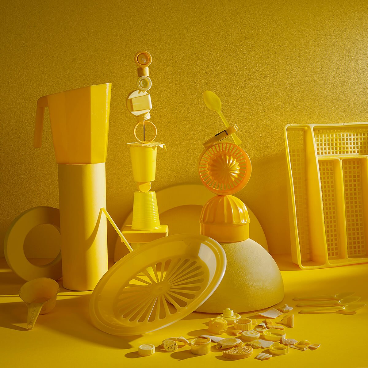
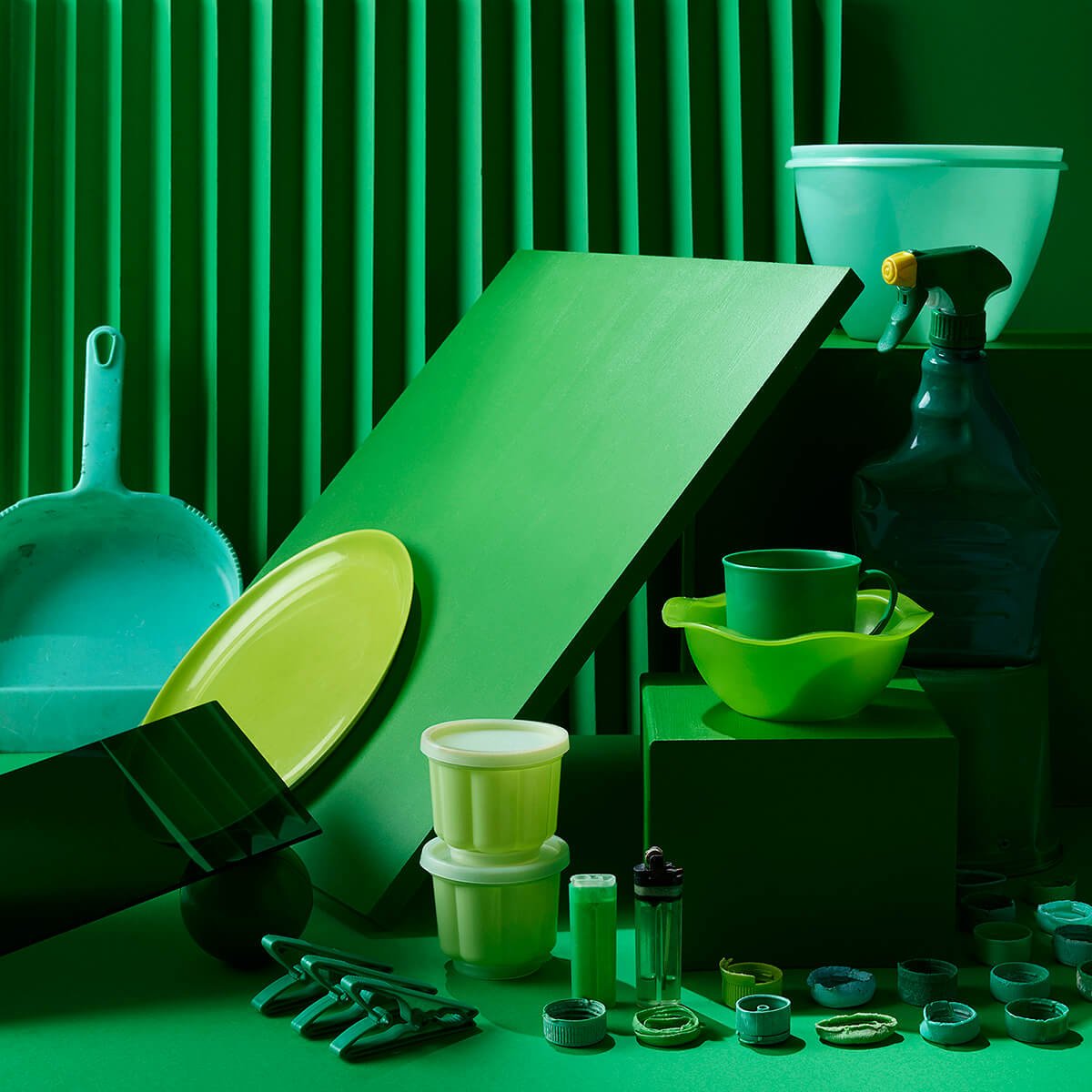
I come from a Fine Art background and I work as commercial photographer. I try to make space for personal projects which allow me the freedom to visually investigate issues that interest me. Commercially, I specialise in shooting homeware, which has become much more seasonal and trend-based. I am aware that so many of the objects I photograph are destined to end up in landfill.
I have always been interested in the value we place on objects; in how the specific visual language used in advertising glorifies certain objects, rendering them desirable. I thought it would be interesting to shoot discarded home objects, devalued by age and deemed worthless, using the same visual language. Last year I won an Instagram competition, and the prize was a shoot day in a pro studio, including basic lighting and a digital assistant. I immediately saw this was the perfect opportunity to thoroughly explore my concept: a professional, commercial shoot of discarded plastic. I treated the project like a high-end production for a big brand. I hired a Phase One medium format camera and additional lighting. I put together a team with a stylist Marieke Goncalves, a Phase One certified digital assistant, lighting assistant, and fine-artist Keri Muller. Keri has been collecting weathered plastic pieces in Cape Town for years. I also organised catering.
I met up with the Stylist before the shoot and briefed her. I wanted most of the plastic objects to be home-related products. We discussed the building of sets for the objects. I discussed the project with Keri over email and she agreed to lend us some of her found objects and to help source more. We visited dumps, recycling centres and second hand shops and shared our finds on a WhatsApp group and from our shared collection we isolated eight colors.
On the day of the shoot I shot tethered to a large monitor and we worked together on the composition and layout of each shot. My brief to the team was for the images to comment on single-use plastic and the life of objects, to comment on consumerism and the glorification of goods, and to shoot found plastics in a polished, high-end advertising style – counter-weighing built-in obsolescence by immortalizing these found objects.
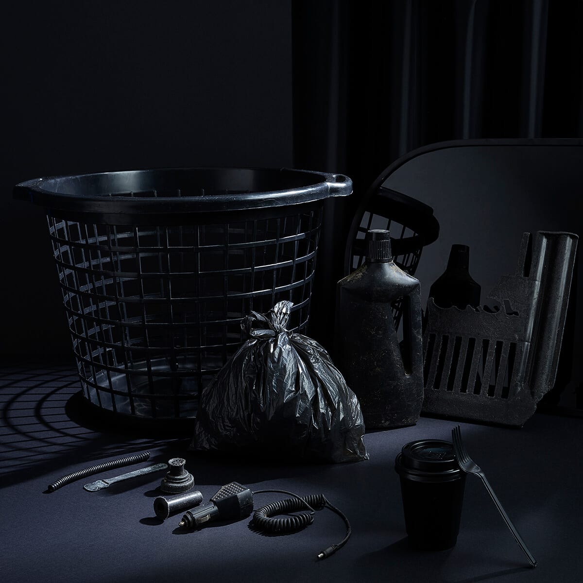
Inge’s winning image for our Colors theme
“This image demonstrates our attachment to color in daily life by the simple gesture of removing it from the image. It is, to me, the obvious winner, as some thought went into thinking through the problem of representing color’s importance to us, how much we take it for granted, and trying to find a way to show that most effectively and simply, which isn’t easy”. – Richard Mosse
“An exercise in color restraint, Inge’s still life scene of modern plastic goods, globally ubiquitous, takes a moment to appear from the darkness. Black and murky, like the thick and ancient crude oil from which they were formed, these objects stand as icons to our throw-away, consumerist culture. The message is clear – just as these items almost disappear into the blackness, so is their inherent environmental destruction so easy to ignore.” – Life Framer
What about the use of a single color in each scene? Was this a purely aesthetic choice, or did you want to represent something analytical too?
The use of single colour tones is a tool to isolate the objects and show them in a very stylised, graphic, world that is a bit detached from reality. It is also a popular trend in pop culture still-life photography. I also did think of the irony of showing some single-use plastics objects in this single coloured world.
And why the name “My Best Life”?
This project aims to give everyday mundane objects their “best lives” by lighting them beautifully and shooting them using advertising language. Many plastic products have built-in obsolescence. They are not created to be treasured. In a way they have never been seen in the same way we would view a designer-branded object. The project aimed to give these discarded objects their moment of glory in front of the camera. By lighting them in a way that would show their best selves and shooting it with a high resolution expensive medium format camera. The objects ‘lived their best lives’ for that moment in the studio. The title also plays with this indelible idea of us living our ‘best lives’ through a system of vast, insatiable consumption.
I also imagined future archaeologists finding these intact plastic artefacts as clues about a lost civilisation that produced such a miraculous substance out of prehistoric organic matter, in such vast quantities that it was considered disposable. These alchemists were unaware that their invention would not only outlast them, but almost kill the biosphere in the process too. These images could be a kind of exhibition catalogue of those future archaeologists’ findings.
You specialize in homeware and interior design photography. Tell us a little bit about where your photography journey began, and how you found this niche.
My father was a keen amateur photographer and his regular slide shows inspired me; I wanted to be a photographer from a very young age. I studied Fine Art and majored in the Photographic arts at Rhodes University. After graduation I had to pay back my student loan and I moved to Cape Town, where I started working as a camera assistant on international commercial shoots. This naturally led me into eventually getting my own work as commercial photographer.
I started off shooting both fashion and décor equally. I loved both worlds and delayed specialising in either. I did however always treat the models as props, they were normally very static and my work always involved a lot of control. At some stage Pinterest took off and a home décor became much more trend-focused. Fashion brands followed by releasing Home departments. That’s when I found my niche in shooting Homeware, which is essentially fashion for the home.
Who or what inspires you in your work?
My Fine Art training has always influenced my way of seeing and working. I see myself as less of a technical photographer and more of a creative. I often use photographic lighting equipment in unconventional ways. I am inspired by daylight and the emotional response we have to lighting.
I love magical realism. I enjoy books by Haruki Murakami and Ben Okri. I have always admired Rineke Dijkstra’s work. I recently saw Generation Wealth by Lauren Greenfield and it absolutely blew my mind.
I have always aimed to balance my commercial work with personal projects and these projects investigate issues I am interested in. I find my own mind fascinating and exploring it is often the starting point of my personal work.
And knowing what you do now, what one piece of advice relating to photography would you give your younger self?
Don’t be too attached to one definition of photography as it’s constantly evolving. Be patient.
As I understand it, you live and work in Cape Town. What’s the photography scene like there?
Cape Town is a world destination for commercial shoots. There is a big production industry here catering for film and still shoots. We have beautiful light and locations. Cape Town therefore attracts many photographers creating healthy competition and high standards. The fine art scene is also doing very well with world class galleries like the Zeitz MOCAA opening its doors in Cape Town celebrating Contemporary African art. David Goldblatt, Pieter Hugo, Guy Tillim and Zanele Muholi are all South African.
And finally Inge, where next? Do you have any more personal projects in the works?
There are a couple of projects in the pipeline indeed. I am very excited and grateful for the Life Framer prize as it will help me materialize some of these ideas and set up the shoots.
All images © Inge Prins
See more at www.ingeprins.com and follow her on Instagram: @inge_prins
Image credits:
Photographer: Inge Prins
Stylist: Marieke Goncalves
Plastics Collaborator: Keri Muller
Location and Gear: Sunshine Company Cape Town
Digital Assistant: Myles Dicky
Lighting Assistant: Reece Menteath
Camera: Phaseone XF IQ350
Lighting: Profoto