EDITORS’ PICK
A Palette of the Imagination
COLORS
Colors Editors’ Pick
Following Marion Tandé’s selection of winning images for our COLORS theme, this compilation of 20 images, selected by the Life Framer editors represents some of the other talented photographers whose work struck us and left a mark. Each a stunning image worthy of exposure and attention…
These are intended to be a conversation starter… so feel free to join the discussion on our social networks.
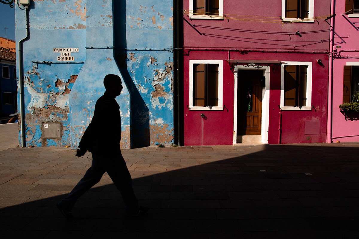
BANNER IMAGE COURTESY OF ANNA PASTORELLO
@annapasto92
“This photo was taken in Burano, the small island near Venice, perfect spot to play with colors and imagination. Patience will bring you playful shots in a perfect open air palette.”
Editor’s comment: An excellent composition by Anna – the diagonal line leads straight to the door which lies on the third, with the silhouette lying on the other third. The colors split roughly down the middle. The lines are clean. Excellent framing all the way around, giving drama to a quiet Venetian scene.
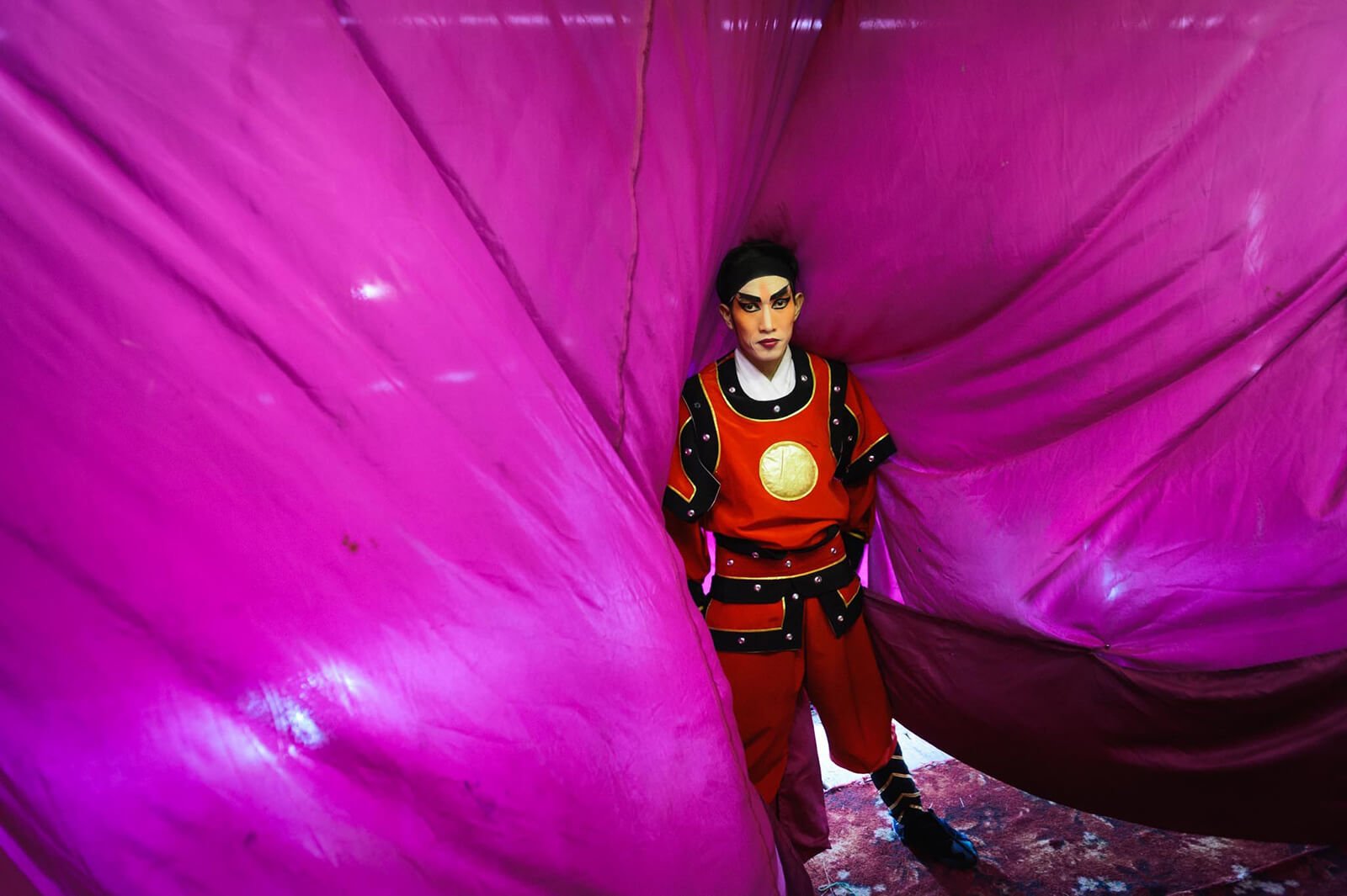
IMAGE COURTESY OF NOAH SHAHAR
www.noahshahar.com / @noah.shahar
“Chinese opera players I shot backstage in Bangkok. Their colorful costume and setup made me feel I stepped into a world of fantasy.”
Editor’s comment: The form of the magenta cloth leads the eye unmistakably to the subject, drawn out in clashing colors. It’s an excellent framing device, to center the subject, and his expression gives a glimpse into the hard life behind the scenes of a theater production.
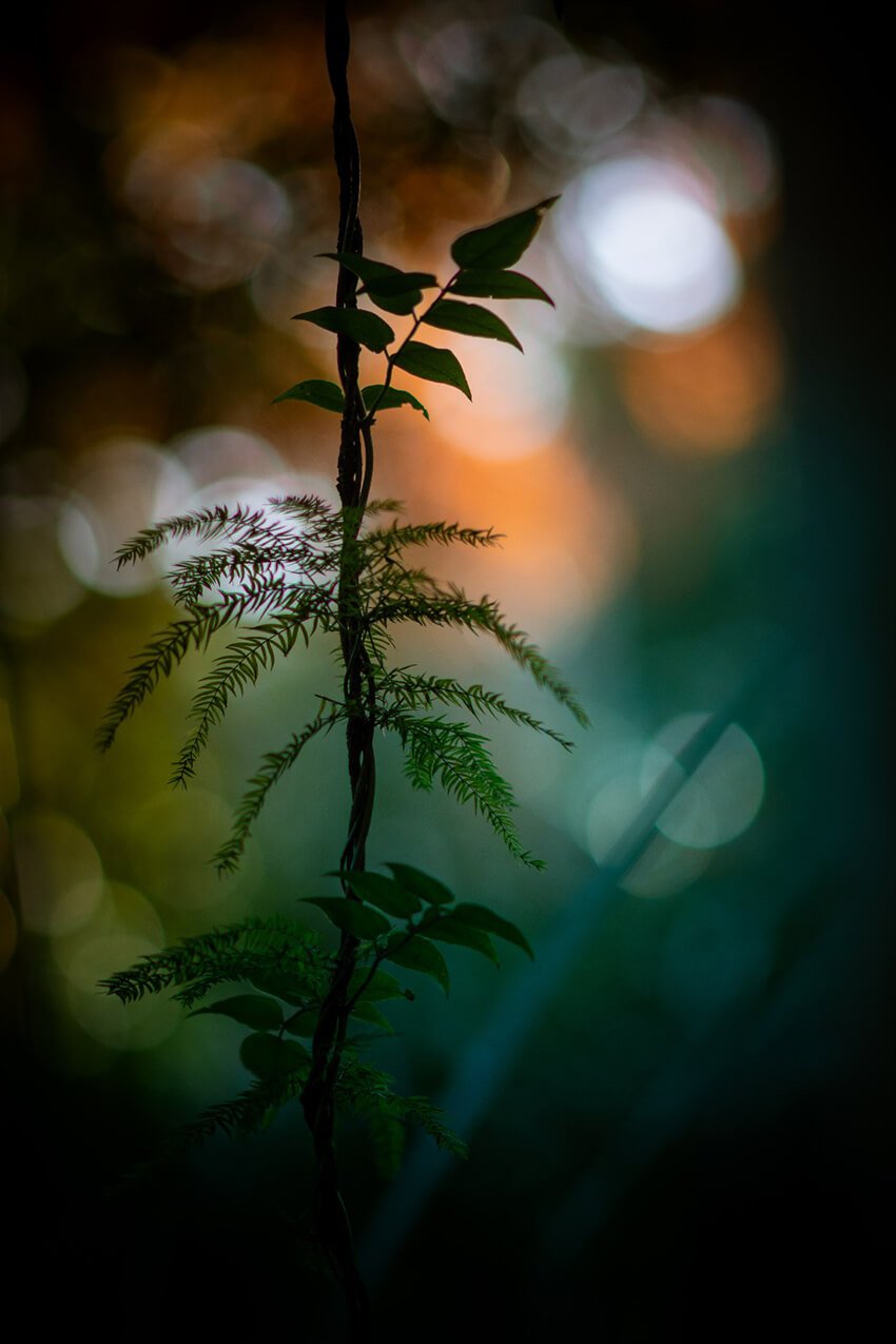
IMAGE COURTESY OF JOHN DELLAERT
www.jclema.com / @johndellaert
Editor’s comment: The background colors in this image set off the graceful silhouette of the subject in a lovely way – highlighting the beautiful and delicate ephemerality of nature.
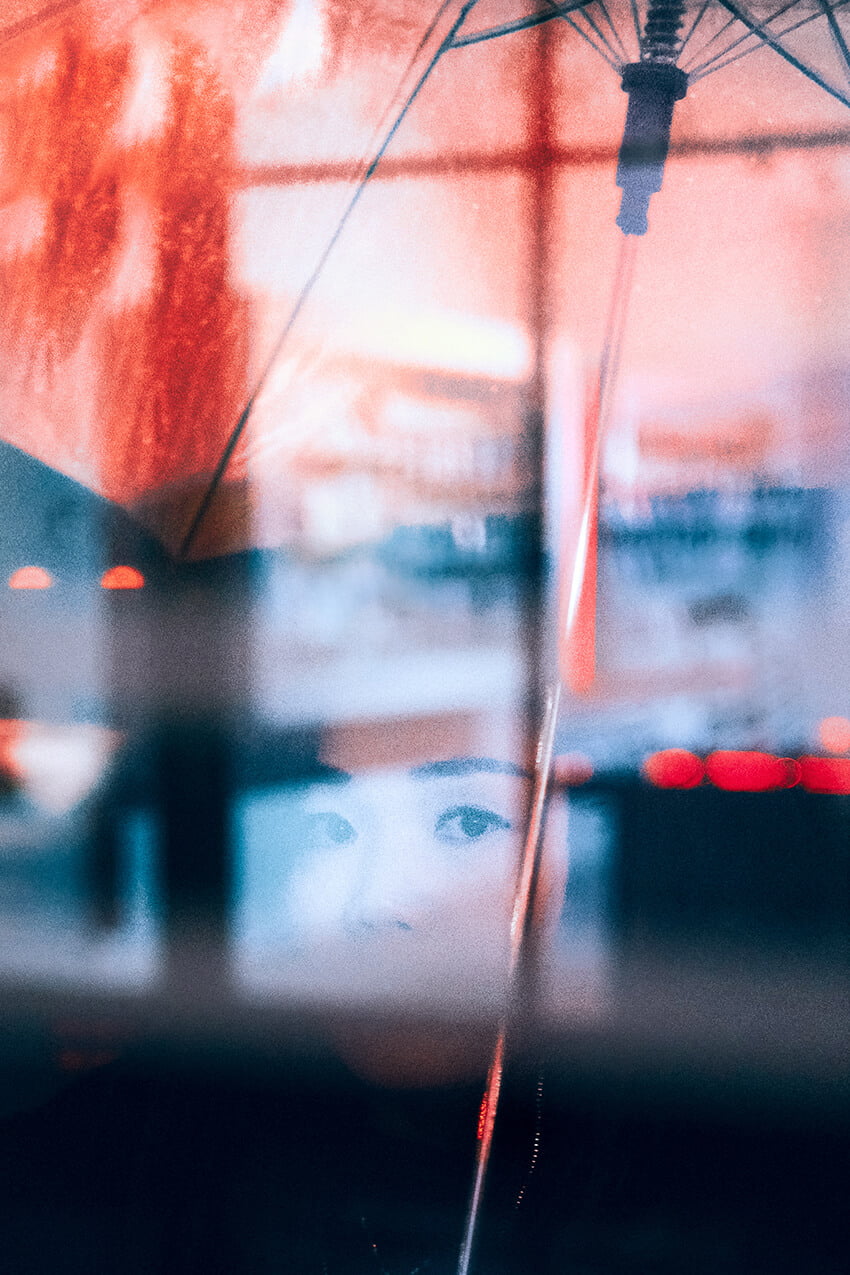
IMAGE COURTESY OF JOEP HIJWEGEN
www.joephijwegen.com / @joephijwegen
“This series highlights the duality of the color red. Red keeps popping up in my images in a particular way. Hinting of both passion and danger, I think it’s symbolic for the complexity of human desire, simultaneously exciting and terrifying us, pulling us in and scaring us away. All the images are candid street photography, showing how we find this tension in our everyday life.”
Editor’s comment: In this shot the complementary colors work to great effect. The framing, narrow depth of field and use of reflection adds to the drama, leaving us with a sense of haunting mystery not easy to achieve in candid street photography.
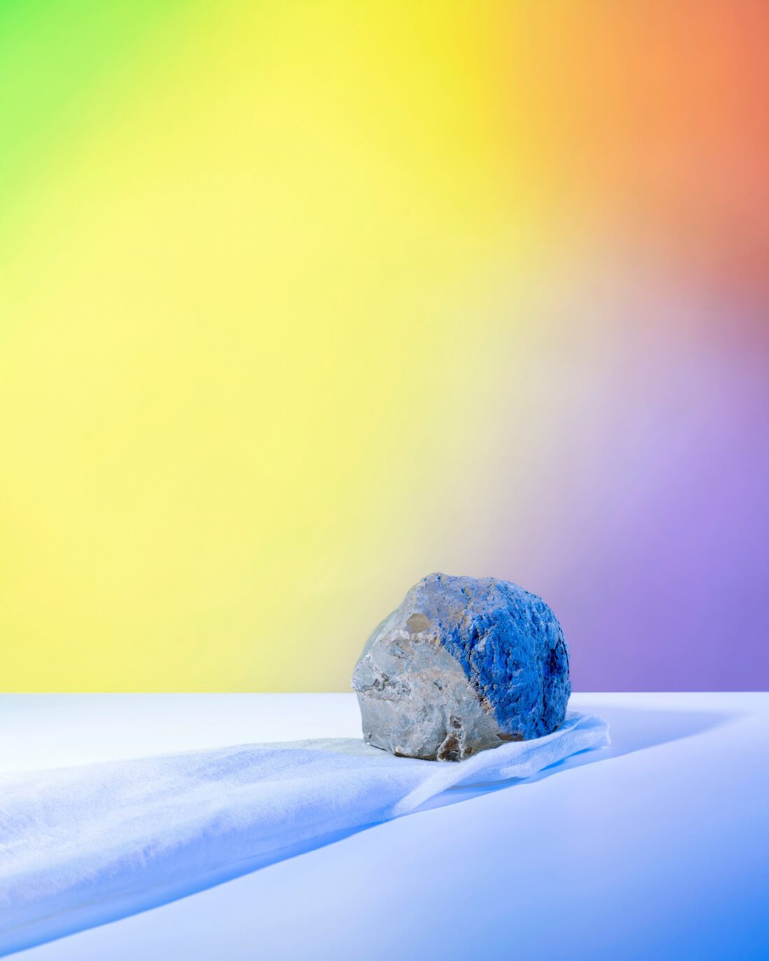
IMAGE COURTESY OF EMANUELE MOI
www.emanuelemoi-photography.com / @photophagos
From the series Wunderkammer. “This image, titled “On Levity”, is part of my still life project – an exploration of symbolism and the ambiguity of interpretation.”
Editor’s comment: An artful composition using color as the primary constituent. The rock, sitting on the lower third, gives the color form and focus. It’s almost as if the color was the subject and the rock the primary frame element. It’s abstract in meaning, but the dichotomy of the natural and the artificial, the old and the new that Emanuele creates is fascinating.
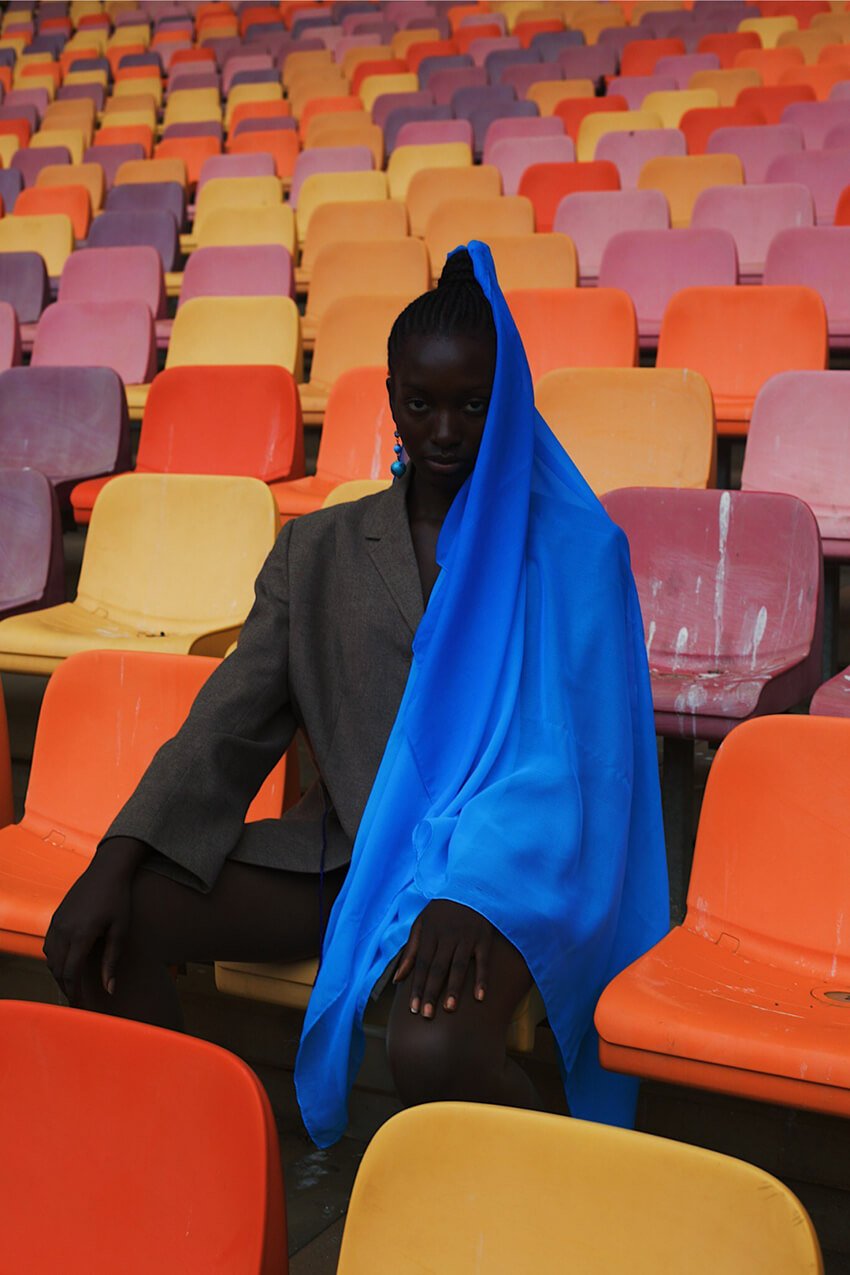
IMAGE COURTESY OF OBIAGELI ADAEZE OKARO
@adaezeokaro
”The title of my photo is “The Dark in the Rainbow”. In every rainbow that blooms, there are colors that you don’t see right away. The ones that are in between or at the ends of the rainbow, that they almost seem faint. But they aren’t the ones you see and scream of excitement when you sight them from your balcony after a night’s pour. It’s the one you never seen. It’s the one you never choose to see. With lucid colors, shown in clothing, head gears and backgrounds I used them as a tool to illuminate and tell a story. Which is having to hide parts of yourself, your identity so that you don’t come off as different, odd or ugly. I used these bold colors to say you can be anywhere you want to be, be whoever you want to be, no matter the rainbow you find yourself in. Because rainbows don’t create themselves, they don’t choose the colors they want to be. They exist for a purpose. And for me the purpose is to bring beauty and other good things to this not soo perfect world of ours.”
Editor’s comment: Everything in bright color is easy to make out, but the central model is literally shrouded in mystery. The preponderance of shadow and lack of clarity of the subject combined with the stark color of the empty chairs offers up a multitude of possible interpretations of this image. A captivating shot.
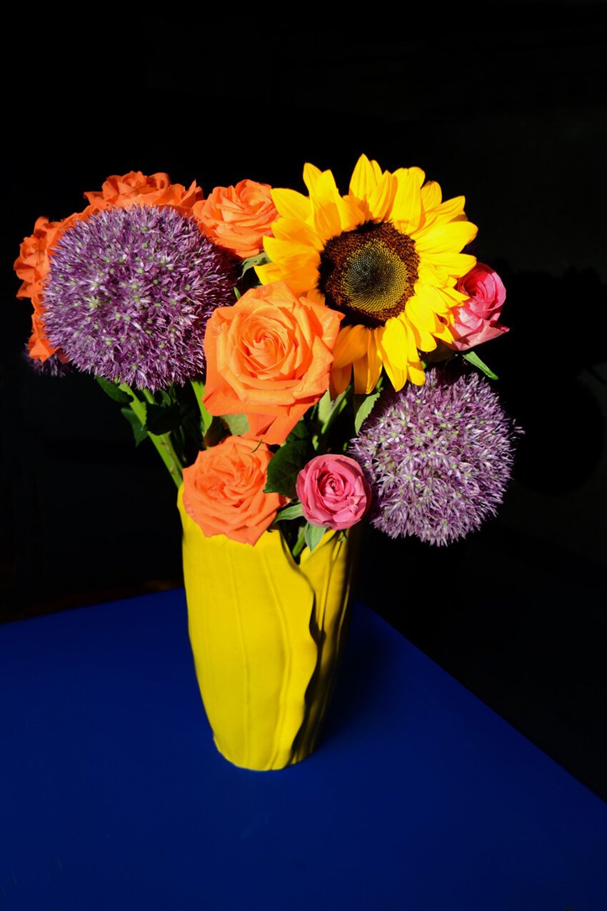
IMAGE COURTESY OF CATHY HASSAN
Editor’s comment: The bright, almost unnaturally vibrant flowers on a black background in this still life bring our theme of “color” to life – giving the scene an almost three-dimensionality. Placing the yellow-covered vase off-center, and on the table’s diagonal was an interesting touch, further enhancing the impact.
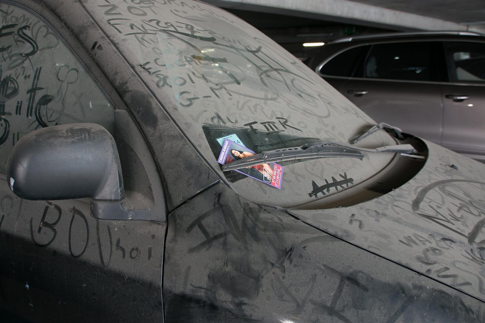
IMAGE COURTESY OF KRZYSZTOF SZCZUREK
www.tofrat.eu / @tof_rat
Editor’s comment: Curious juxtapositions often make for fantastic photography subjects, and this image is no exception. The dust and drabness of the car contrasts immediately and deliciously with the vibrancy of the “massage” ad, and then the messages scrawled into dirt – a palimpsest of cultural symbols and codes – slowly reveal themselves to the viewer. A good eye!
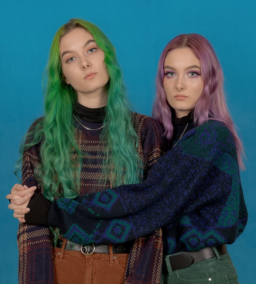
IMAGE COURTESY OF CRUMMY GUMMY
www.crummygummy.com / @crummygummy
From the series Salad Days. “This series features young adults living in Central Florida who are discovering their identity through fashion, sexuality and one’s own self-awareness.”
Editor’s comment: This shot is a veritable cornucopia of color, from the differing hair and eye colors, to the way the clothes hint at matching, but don’t quite make it. And then there’s the body language – protective of each other, slightly guarded against the photographer. It’s a wonderful portrait exploring friendship and self-expression.
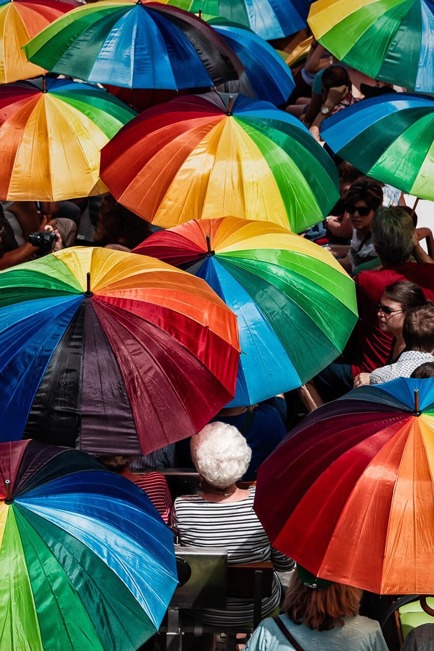
IMAGE COURTESY OF IGOR VAN DE POEL
www.igorvandepoelfotografie.be / @igorvandepoelphotography
Editor’s comment: Spaced like mushrooms on a forest floor, the umbrellas in this shot seem to have a life of their own. A shot of white from the hair of the centrally framed woman, contrasting with the rainbow colors of the umbrellas is a bonus. Spectators become the spectacle.
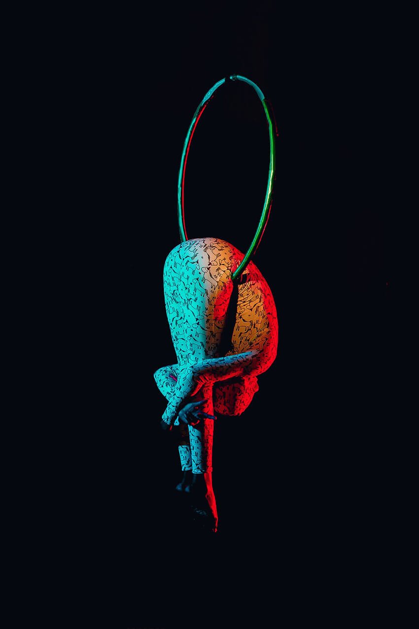
IMAGE COURTESY OF SALVADOR LATEEF
@lasalvy
From the series Grace. “She moves with so much grace it was like watching God’s angel glide in air with faith, gravity didn’t even have a chance.”
Editor’s comment: The color in this image really heightens the drama and emotion of this shot – elegance frozen in the great abyss! Zoomed in, there’s also a lot of beautiful detail, especially on the subject’s outfit.
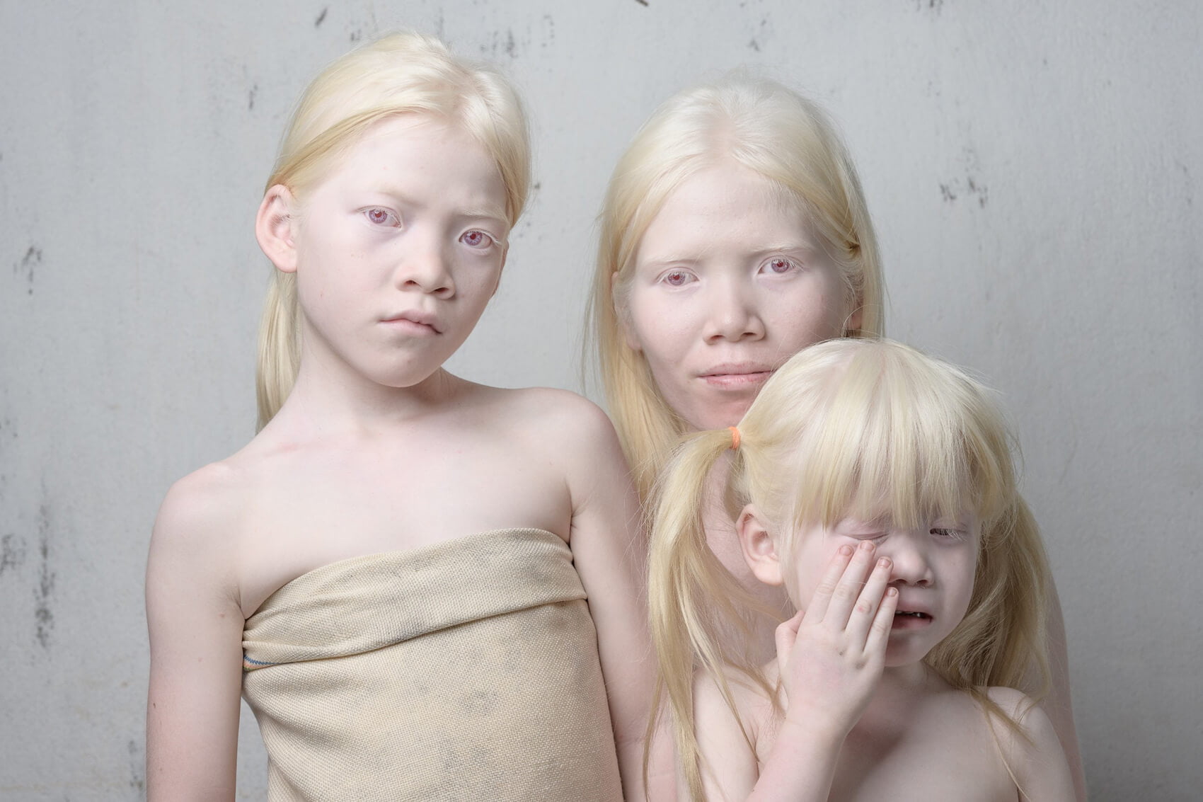
IMAGE COURTESY OF ALDEN ANDERSON
www.360nomad.org / @360nomad
Editor’s comment: While it may be tempting to say that this portrait deals more with the absence of color, nothing could be farther from the truth. The pale tints and hues of the albino children here are as deeply riveting as any bright primary color, perhaps even more so. The choice of background is deliberate, but the way the formality of the portrait is disrupted by the little one’s expression of distress makes it more human and emotive – encouraging empathy in the viewer. Difference is shown to be beautiful, but also difficult.
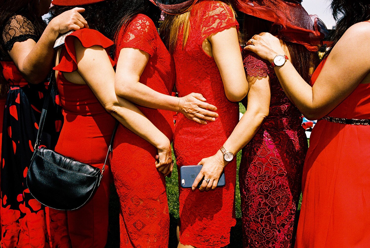
IMAGE COURTESY OF OSCAR O’SHEA
www.oscarosheafilm.com / @osca___r
“This series comes from a project I undertook to create an expose photo book of the Melbourne Cup Horse Races. The intention was to capture images that exposed this upper class display of excess and celebration, whilst in an environment built around animal cruelty.”
Editor’s comment: There’s something fascinating about how the bodies fit together in this tightly framed shot – posed, yet with plenty of spontaneity. They’re facing away from us for a photo opportunity, yet from the back there’s much more truth to the image.
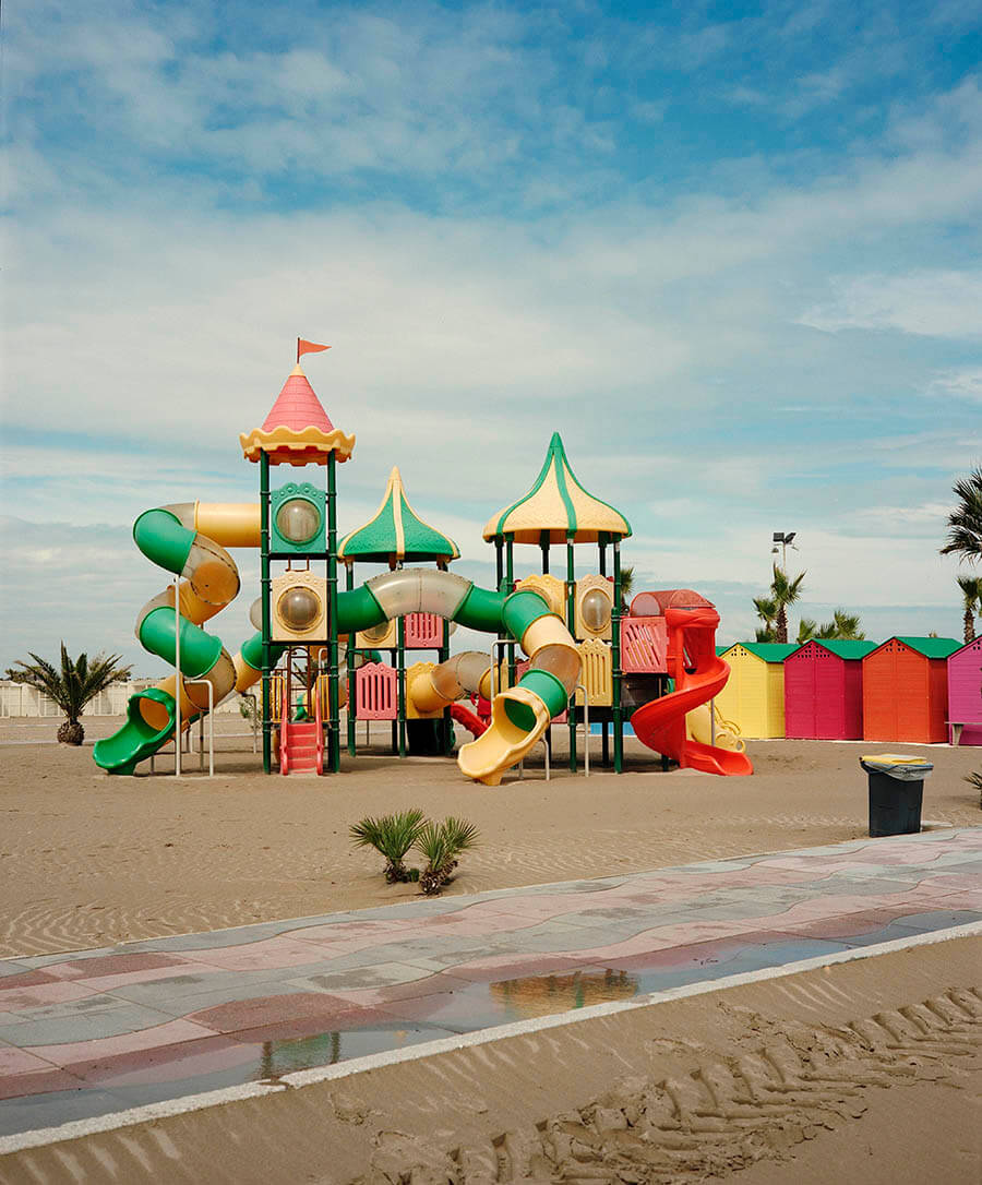
IMAGE COURTESY OF ANDRE KIRSCH
www.andrekirsch.de / @andre.kirsch_photography
Editor’s comment: A bit like finding water in the desert, the bright playground in this shot gives a sense of finding something precious and unusual in a land that would otherwise be devoid of color.
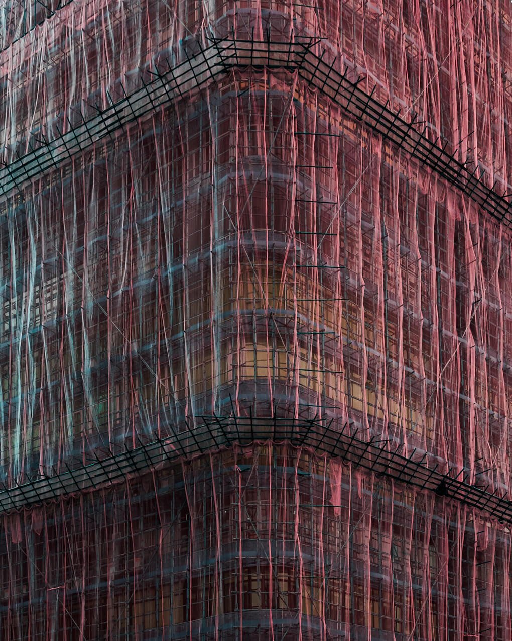
IMAGE COURTESY OF TOM LEIGHTON
www.tleighton.com / @tomleightonart
Editor’s comment: An interesting combination of color, texture, and framing. The choice of shooting at the corner creates an uncommon experience, especially since the canopy softens the hard lines of the scaffolding. It feels like an organic, alien form.
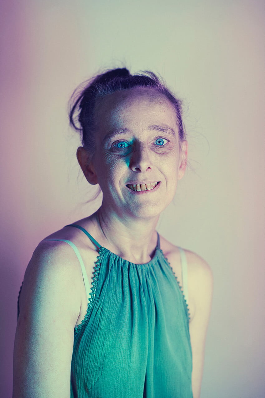
IMAGE COURTESY OF DEE RAMADAN
www.deeramadan.com / @dee_ramadan
From the series The Harbour. “Lambeth Harbour is a drop-in centre in Brixton, London for people recovering from substance abuse – helping with recovery, advice and support. The portraits feature people whose lives revolve around the centre, from staff members, peer mentors (advanced recovery) and service users (beginning recovery). The photographs are purposefully void of names or roles – this not only helps people maintain a level of anonymity, but also removes them from the most immediate stereotyping and to help reveal the indiscriminate nature of addiction.”
Editor’s comment: The use of color here, both of the background and on the subject, serve to aptly forward the photographer’s theme – that of addiction and recovery. A considered, adept choice that leads to a compelling outcome – sparse, clinical and baring, painting the subject in something strange but enchanting.
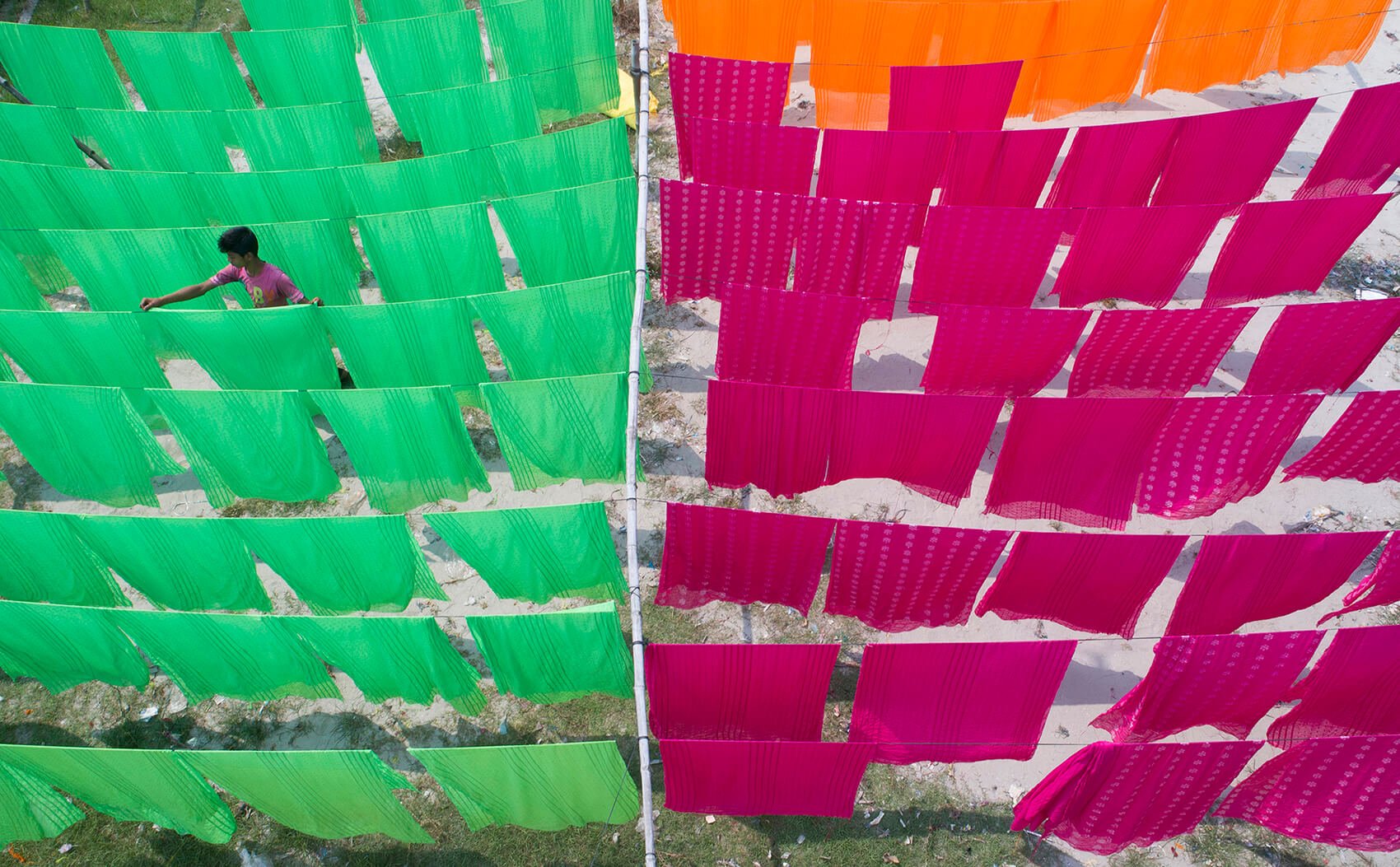
IMAGE COURTESY OF TOUHID PARVEZ
Editor’s comment: A stunning image with rich, complementary colors, off-symmetrical framing, and a strong sense of intrigue as to what is being witnessed.
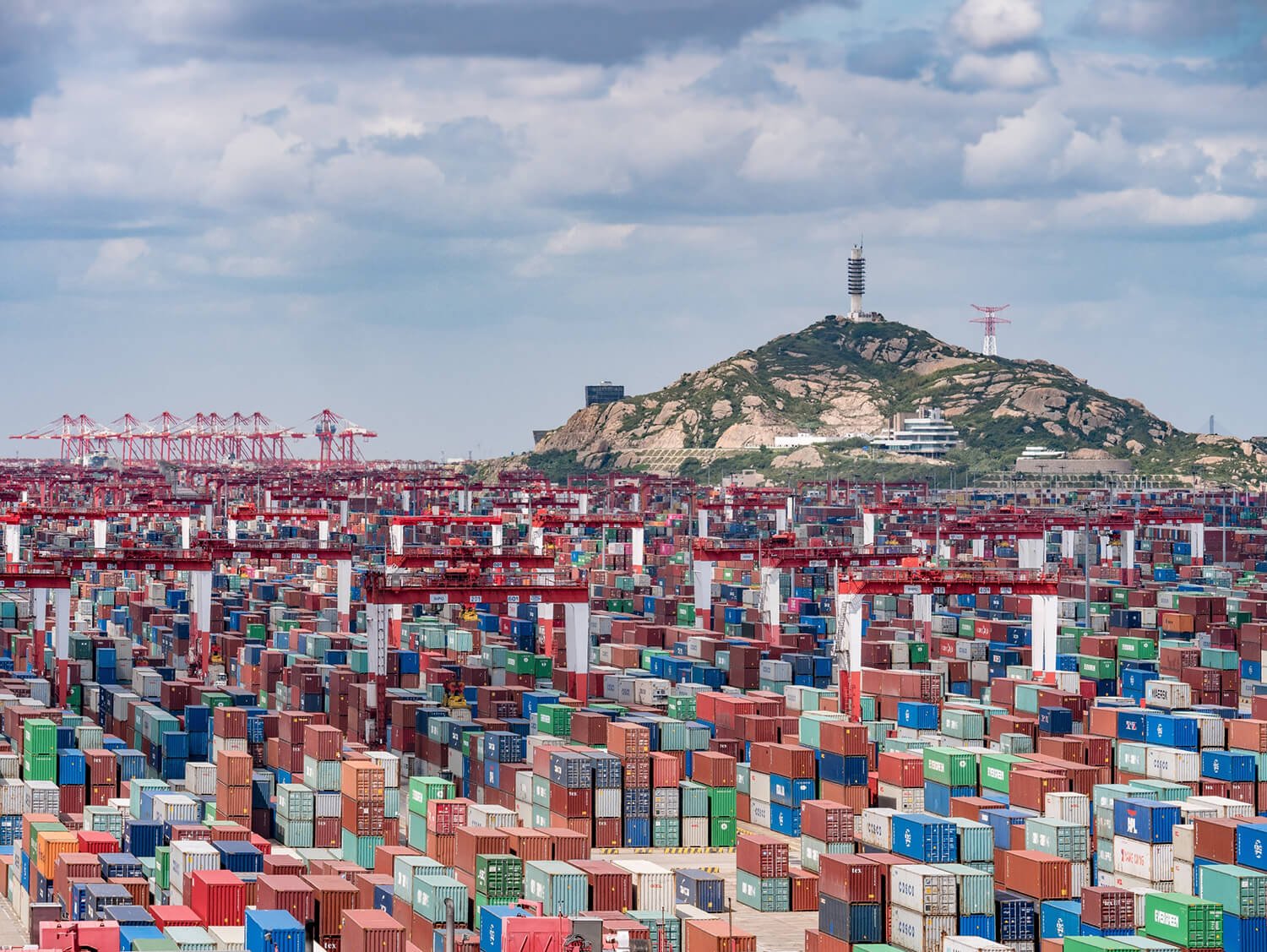
IMAGE COURTESY OF ATTILA BALOGH
www.attila.photo / @guczo
Editor’s comment: This landscape of colorful shipping containers comes across as an unusual city set down in mostly colorless wasteland. It brings into stark relief the immense scale of our global supply chains.
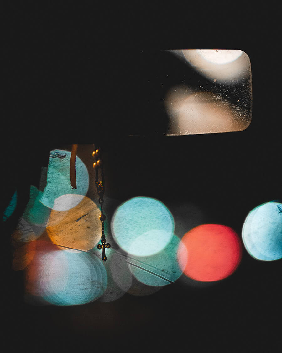
IMAGE COURTESY OF CRISTIANO JURUNA
www.cristianojuruna.com / @cristianojuruna
Editor’s comment: This unusual shot has both beauty and mystery. Simply three elements – the colors, the cross, and the rear-view mirror – combine to encourage reflection in the viewer, to ponder what we’re driving towards and what we’ve left behind, in the broadest sense. A wonderful musing on faith.
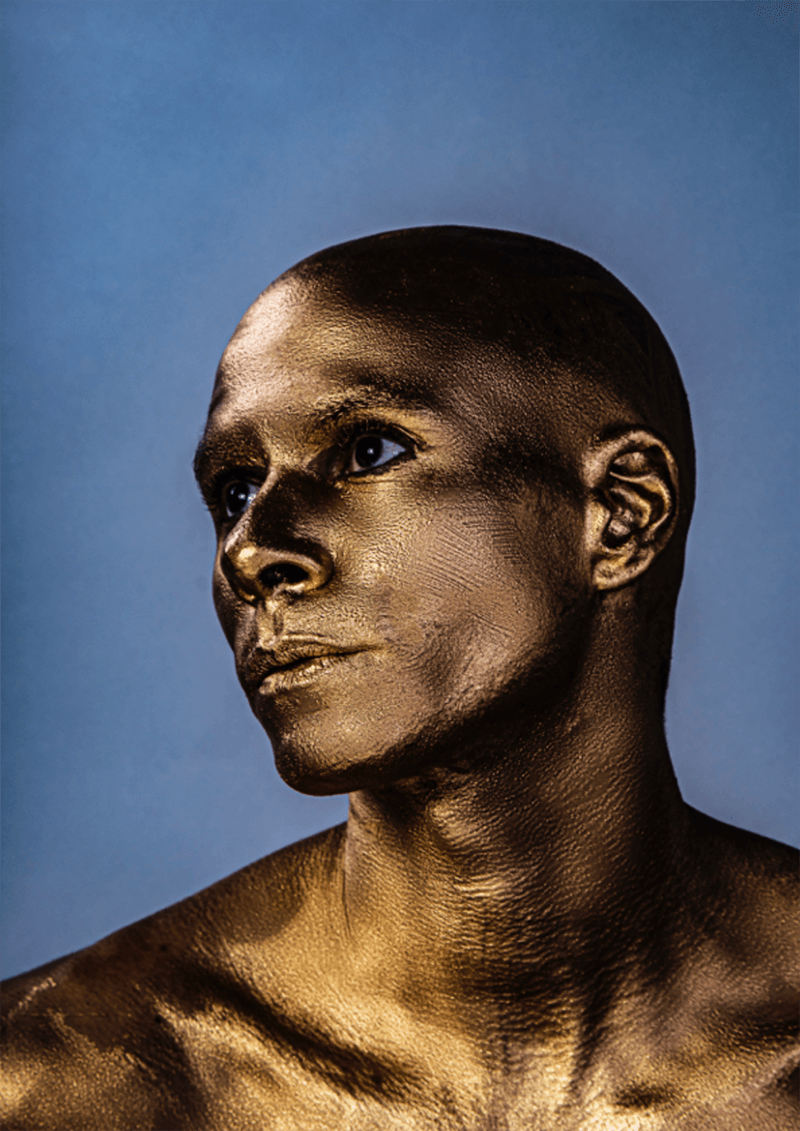
IMAGE COURTESY OF DARRAGH MULROONEY
www.feastyoureyesstudio.com / @feastyoureyesstudio
“As part of the series I shot based on Roman myth, including some other portraits based on the Caesars. I produced this gold self-portrait. I am of dual ethnicity, Irish/African American. Ancient Rome was a mix of so many cultures, so this image is entitled “Not all Caesars had Roman Noses.”
Editor’s comment: Fantastic use of complimentary colors in portraiture here, that feels simple but artful, contrived but honest. Darragh explores his heritage in a way that packs an immediate punch. Adding a bit of blue to the eye sclera is a nice touch.