EDITORS’ PICK
A Wave of Color
COLORS
Colors Editors’ Pick
“Mere color, unspoiled by meaning, and unallied with definite form, can speak to the soul in a thousand different ways.” – Oscar Wilde
Following Richard Mosse’s selection of winning images for our COLORS theme, this compilation of 20 images, selected by the Life Framer editors represents some of the other talented photographers whose work struck us and left a mark. Each a stunning image worthy of exposure and attention…
These are intended to be a conversation starter… so feel free to join the discussion on our social networks.
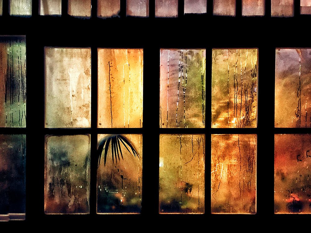
Banner image courtesy of Simona Bonanno from her series Hamadrydes.
www.simonabonanno.com and Instagram: @s_bonanno
Editor’s comment: “An excellent example of how color can transform the ordinary into the extraordinary. A simple, steamy window becomes the threshold to another world here, all through the use of alluring colors and tactile textures that draw the viewer in.”
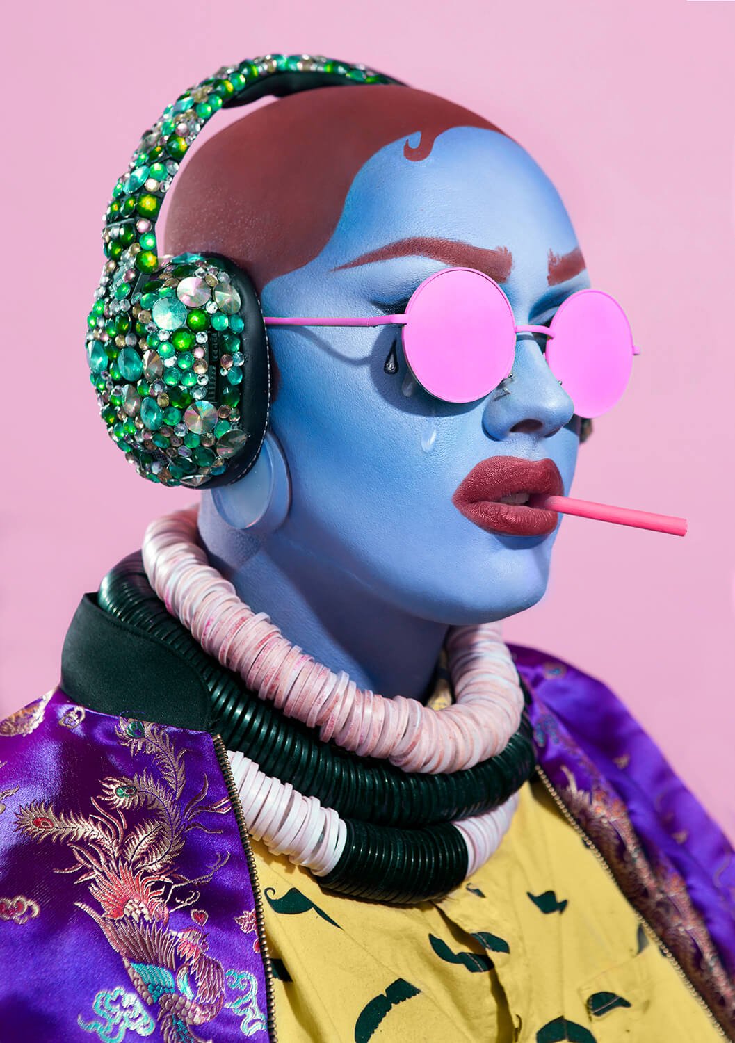
Image and text courtesy of Ash Danielsen from his series Overstimulation.
“Overstimulation is a portrait series illustrating the sensory overload that is the 21st century. The subjects are encased in electric color palettes and are attempting sensory deprivation by blinding, deafening and orally distracting themselves. They are using the very technology that is straining them in an attempt to calm themselves back down.”
www.ashdanielsen.com and Instagram: @ashdanielsen
Editor’s comment: “A confident execution of an apt theme – trying to dull one’s senses using the very technology that’s providing sensory overload. Ash’s fantastic use of electric color palettes makes for something truly striking.”
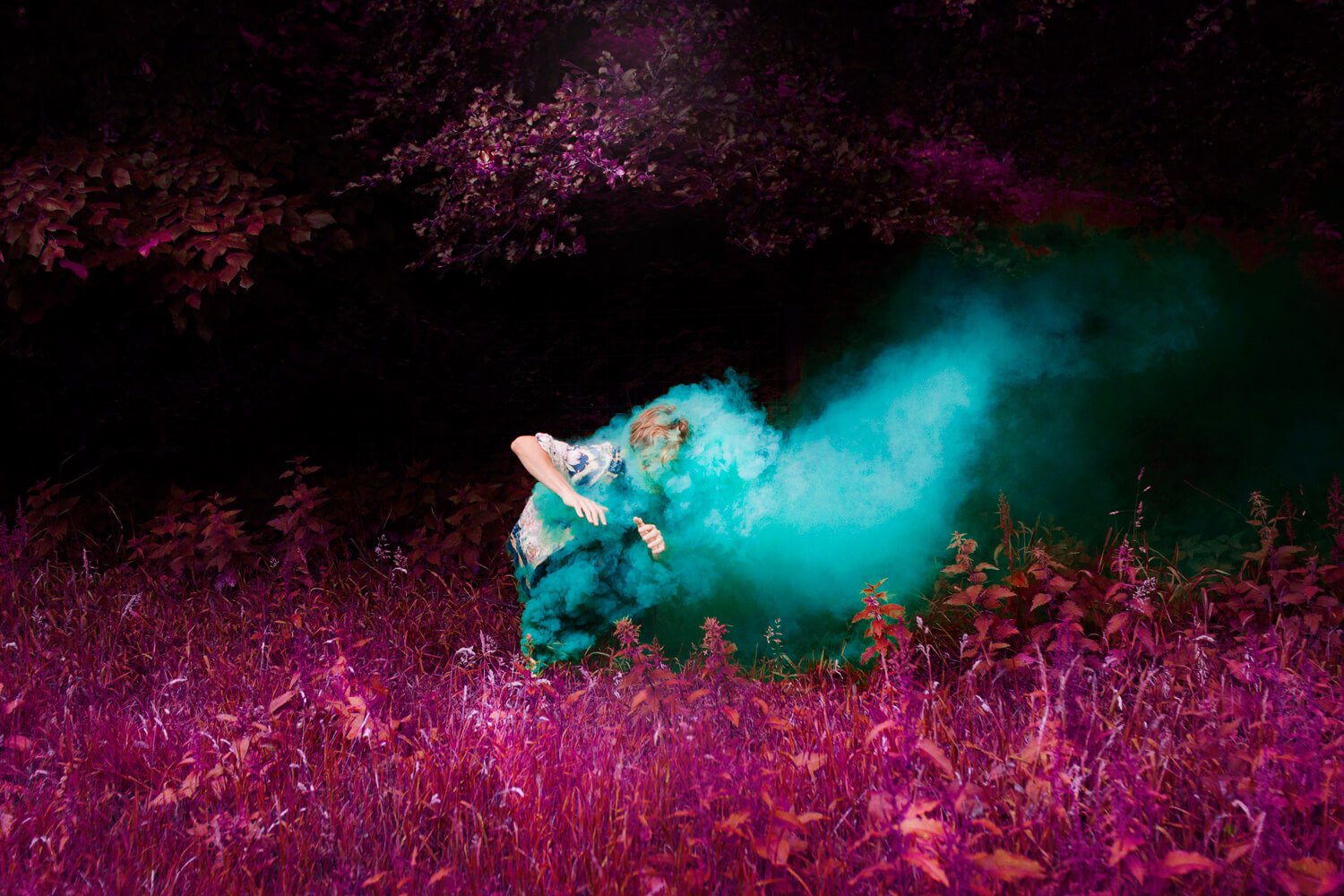
Image and text courtesy of Anouk Van Kalmthout.
“A series of dreamscapes – fragments of travelling through space and time.”
www.anoukvankalmthout.com and Instagram: @anoukvankalmthout
Editor’s comment: “Stunning use of color to create a dreamscape. The intensity of the magentas and blues mirror the intensity of what the subject is going through. It’s a marvelous combination of color and storytelling.”
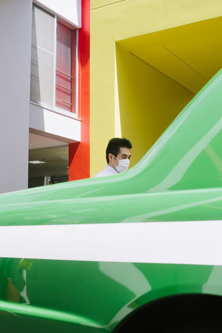
Image courtesy of Gili Benita.
www.gilibenita.com and Instagram: @gilibenita
Editor’s comment: “Here the primary colors accentuate the clean lines of the composition. The human in the middle lends a touch of surprise as well – he feels almost out of place in the shiny, geometric urban world. Well done.”
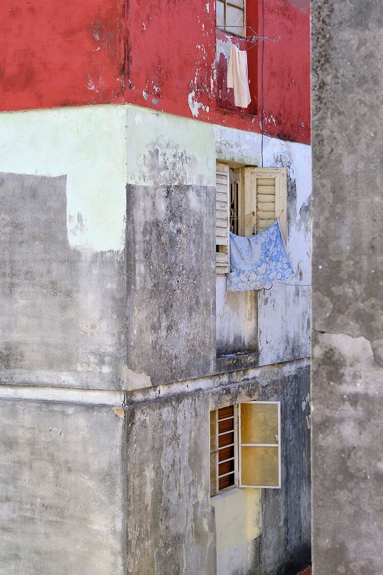
Image courtesy of Soma Kondo.
Instagram: @soma_kondo
Editor’s comment: “Another image showing the brilliant use of color to bring life to the mundane. An added bonus is the optical illusion of the building on the right, which takes a moment to mentally resolve. Well done Soma!”
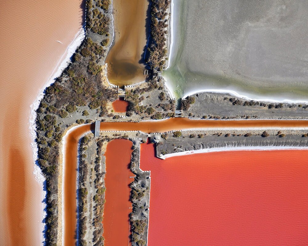
Image and text courtesy of Magali Chesnel.
“The natural and regional Park of Camargue in Southern France captured my heart, my soul and my mind three years ago. Flying above its salt marshes is very inspiring. It captures the mind and senses and elevates them to another realm. The nature there is truly spectacular, showcasing mother nature’s raw and fragile beauty which never fails to impress with its shapes and colors. As saline levels elevate during the summer months the shrimps disappear causing the algae to proliferate. The colors reach their maximum levels of intensity before shifting colors can vary from lighter shades of green yellow to vibrant red. The strong contrasts and geometric shapes of the salt marshes can remind us of abstract paintings. The resulting photographs combine these vivid and natural colors with geometric shapes creating a series of abstract stills that fall somewhere between Painting and Photography. The series references famous paintings while expressing the same powerful emotions as Zao Wou-Ki, Chu Teh-Chun, Chagall, Rothko or Mir’s artwork can provoke. “A painting is not a picture of an experience, it is an experience” – Mark Rothko. I deeply think we should all do with a bit more of Rothko’s principles in our way to photograph, insisting on the primacy of raw emotion to push the boundaries of form and color, to make photos appear as painting-like as possible.”
www.magalichesnel.com and Instagram: @magalichesnel
Editor’s comment: “An amazing aerial shot of the regional Park of Camargue in Southern France. A nice, clean composition paired with stunning colour, makes for something truly arresting – which is getting harder as satellite and drone imagery of the world becomes more commonplace. The way Magali links her work to that of famous painters in her statement, adds another satisfying layer to be appreciated.”
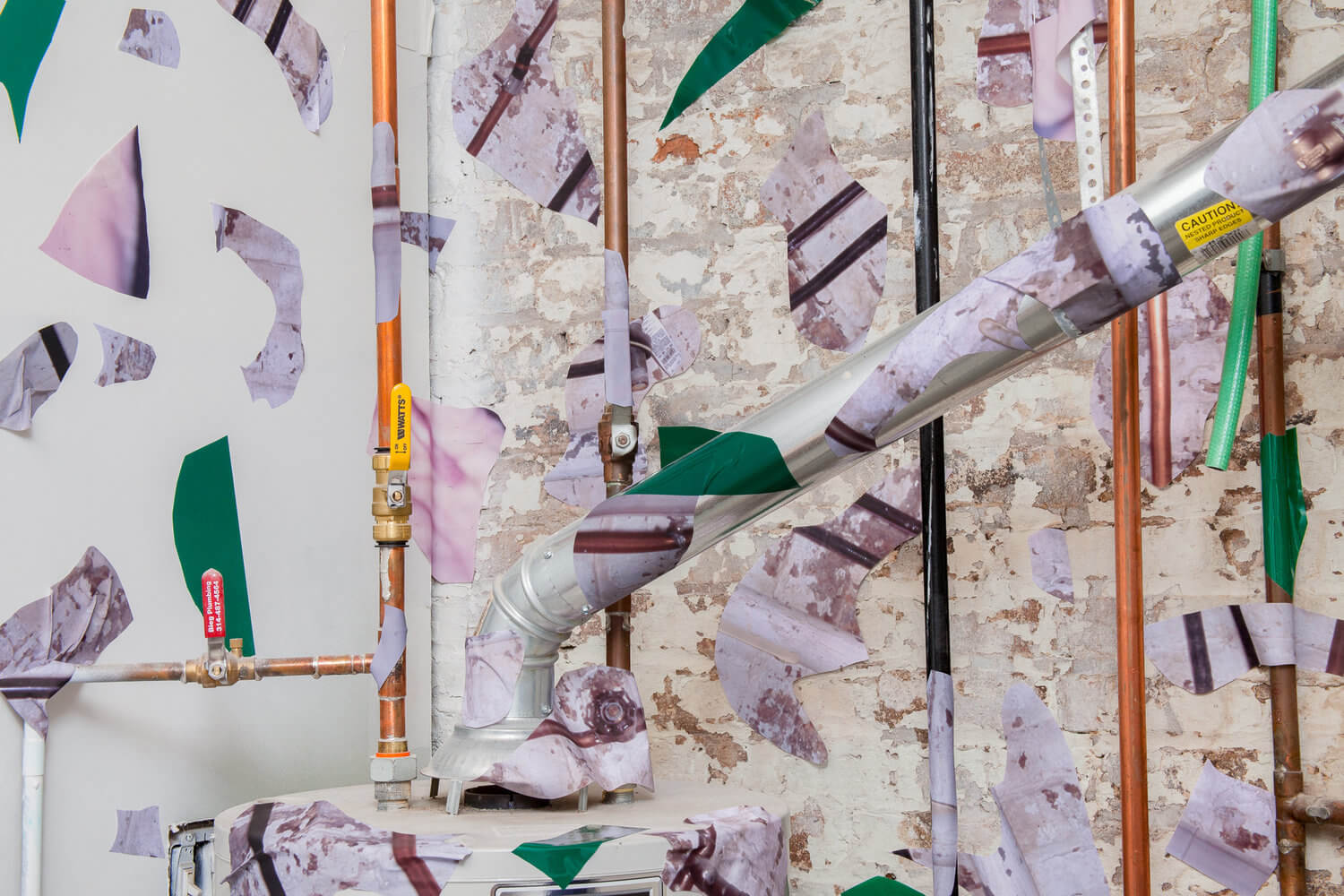
Image and text courtesy of Robert Chase Heishman from his series AWARE.
“This project is comprised of images and installations that ruminate on the architecture of images and spaces. The photographs utilize the forced perspective of the camera to build elaborate tableaux that disrupt, confuse and play with dimensionality. My process is to take photographs initially on film of a space and then print them onto an adhesive fabric inkjet print and reintroduce fragments of the image into a site.”
www.robertchaseheishman.com and Instagram: @robertchaseheishman
Editor’s comment: “An interesting take on the nature of architecture and space. The sporadic repetition of greens, oranges, and purples add to the complexity of the tableaux.”
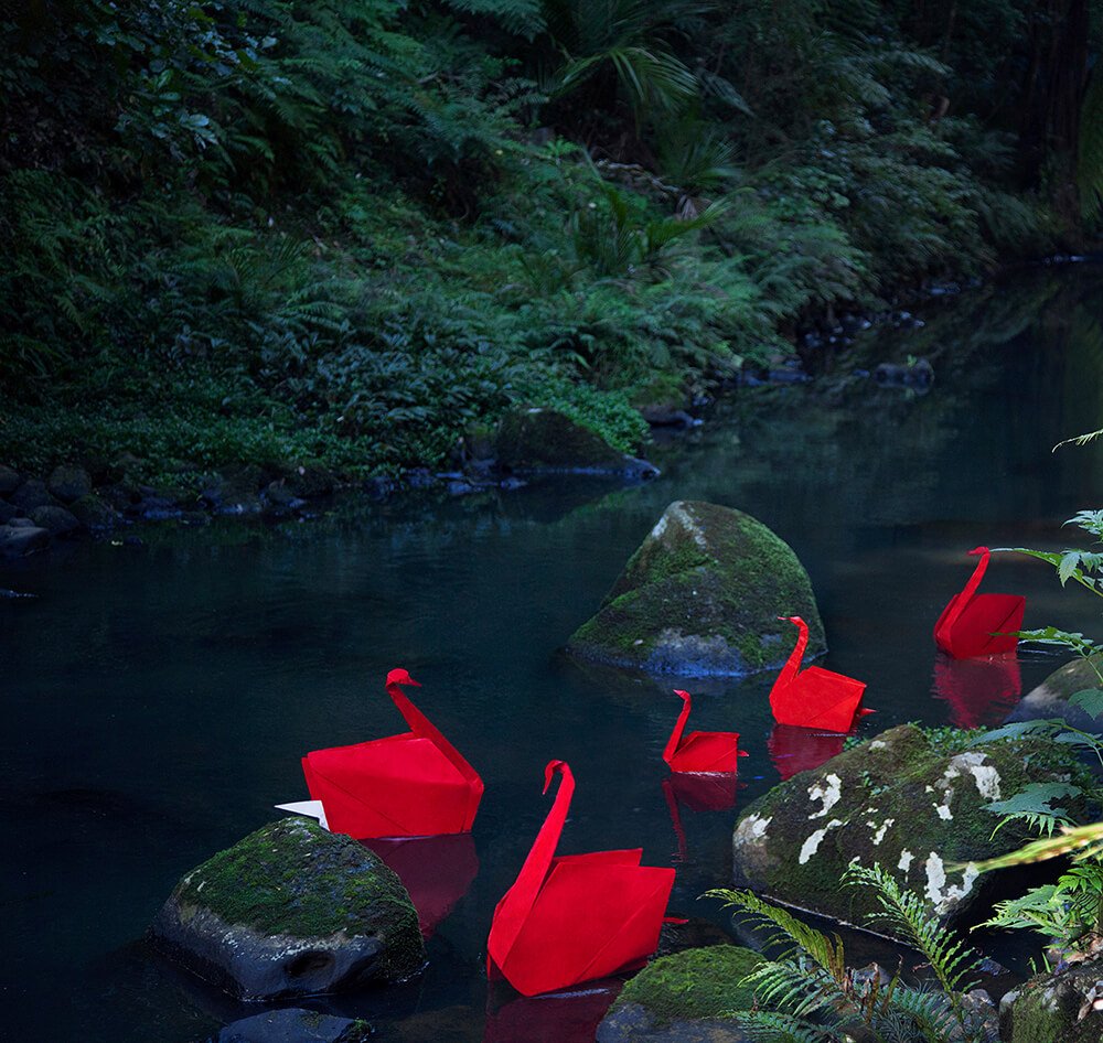
Image courtesy of Jo Bayliss.
www.jobayliss.com and Instagram: @jobayl1ss
Editor’s comment: “Nice use of complimentary colors to draw attention to the swans. The red brings us right in.”
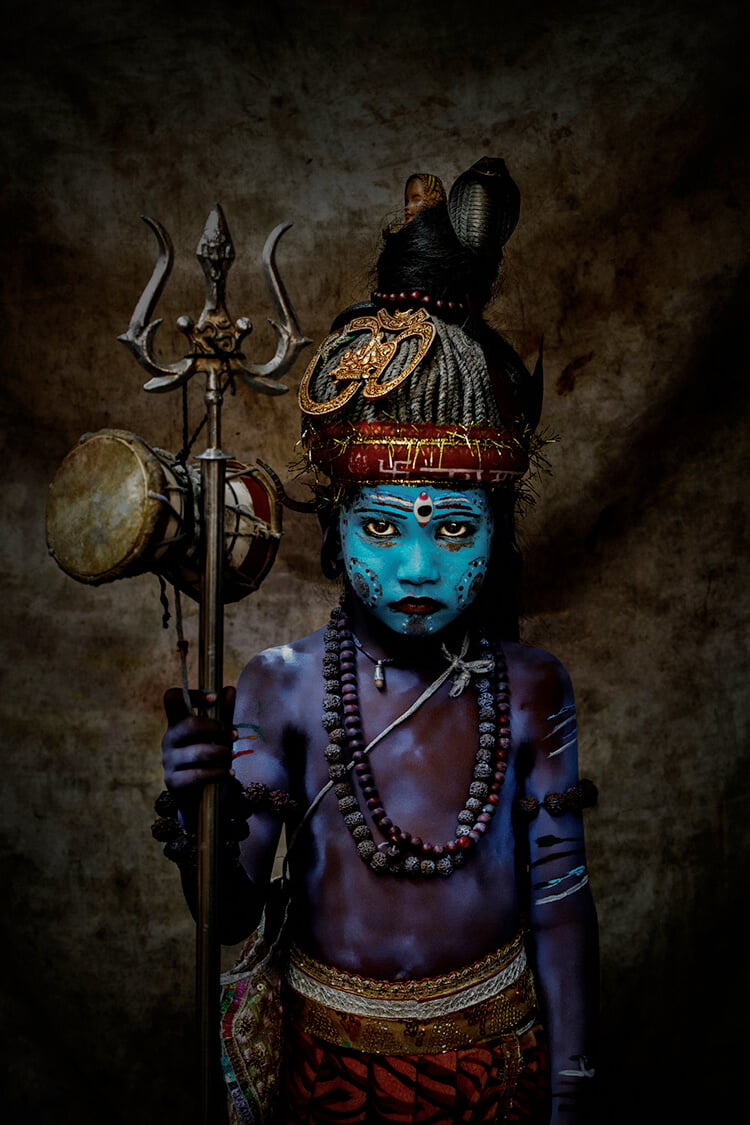
Image courtesy of Donnell Gumiran.
www.500px.com/donellgumiran and Instagram: @donnellgumiran
Editor’s comment: “Every element in this image draws the eye in and fascinates. The electric blue on the child’s face, their intense expression, the fluorescent purple on their body, the red headband. Fantastic use of color; fantastic subject.”
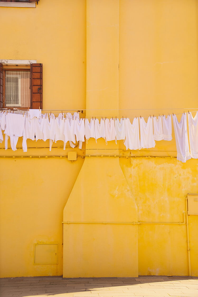
Image courtesy of Lisa Michele Burns.
www.thewanderinglens.com and Instagram: @the_wanderinglens
Editor’s comment: “This photo uses both color and texture to bring life to the mundane. Lisa gives us a beautiful combination of pattern, texture and color pop, transporting us into this vibrant street scene. “
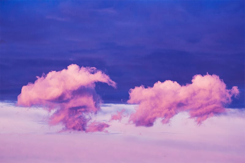
Image and text courtesy of Michael Le.
“My work is an extension of my imagination. I am inspired by the constant flow of culture from past to present. This all plays a huge role in diversifying my artistry. The diversity in the array of work presented are made of multidisciplinary mediums blended together with vibrant colour adjustments and image sampling. Each piece explores a different theme based on my creative process when dealing with the work.”
www.indolestic.com and Instagram: @indolestic
Editor’s comment: “The painterly colors and whimsical composition of this piece have an energy and a pulse. And like cloud forms worldwide – the subject lends itself to a wide variety of imaginations.”

Image courtesy of Nick Isden from his series America.
www.nickisden.com and Instagram: @nickisden
Editor’s comment: “An amazingly simple and clean composition, where the colors add to the starkness of the image. It’s a fascinating take on a very normal American place.”
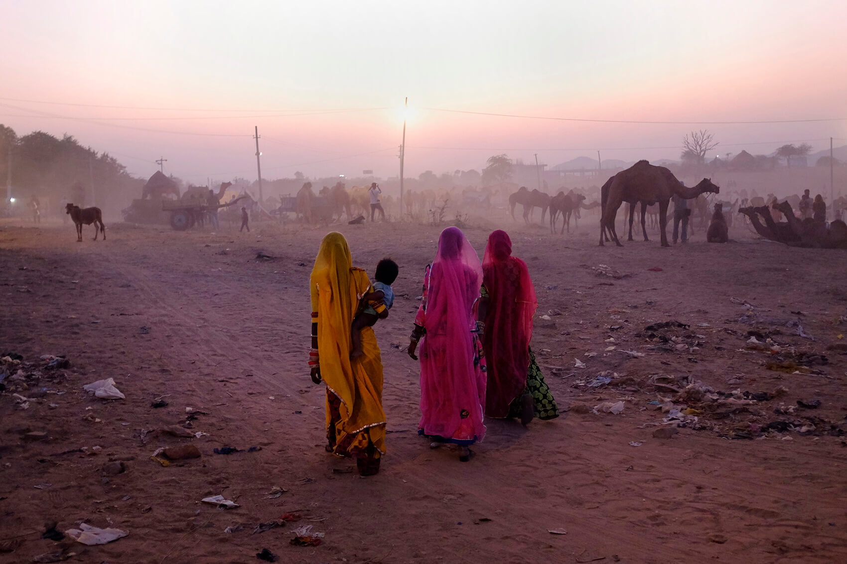
Image and text courtesy of Nil Guasch.
“Walking through the streets of Indian cities is walking through a universe of colour. The walls, objects and people’s clothes are full of color, shades. The textures and contrasts mark the frenetic rhythm of life. A continuous oversaturation that fills ones senses to the maximum.”
Instagram: @nilguasch
Editor’s comment: “Here, the eye lands first on the women walking – their colors are brightest. Then the eye roams a bit and sees the camels melding in with the haze. A fascinating capture that tells a story of place.”
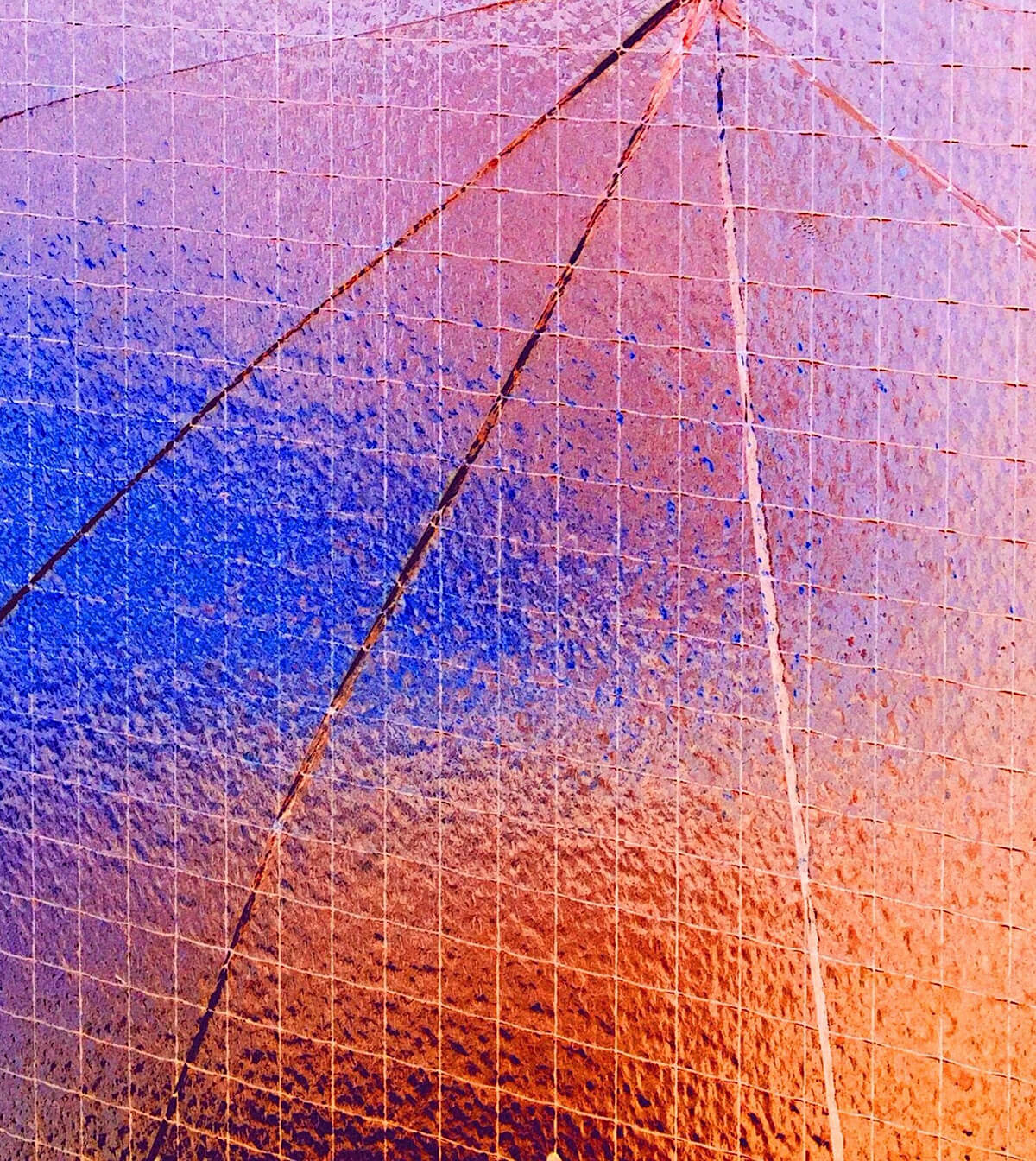
Image courtesy of Ruby Lindsey.
www.rubylindsey.com and Instagram: @rubylindseyy
Editor’s comment: “This image just delights the eyes. Pure color, texture, and lines. Nothing else. Sometimes simple can be the most striking. Nice!”
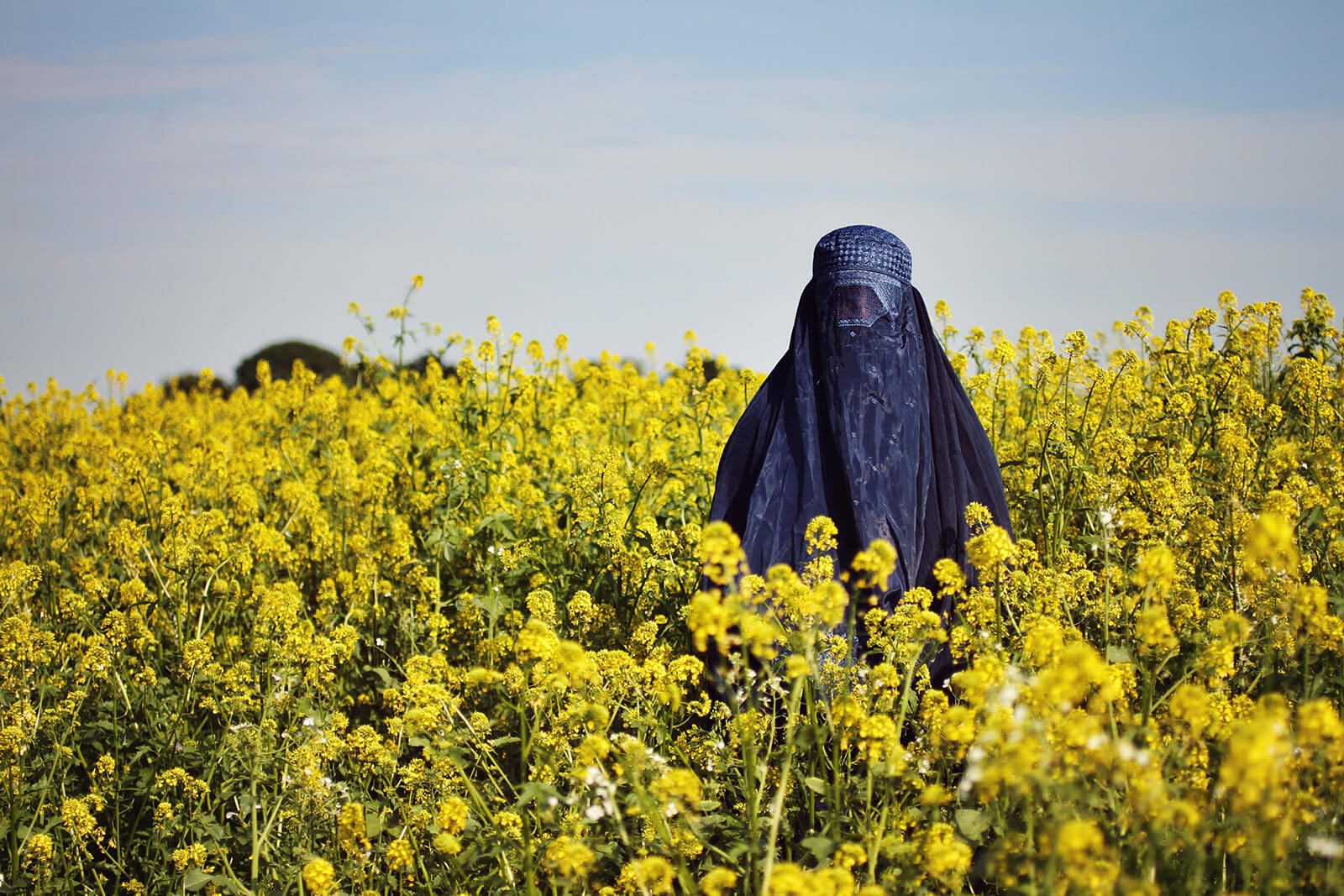
Image courtesy of Kerstin Niemoeller.
www.knfotos.com and Instagram: @kerstin_niemoeller
Editor’s comment: “Fantastic use of complementary colors (yellow and purple) combined with an elusive and mysterious subject. We can just see a hint of her expression to draw us in. Nicely done.”
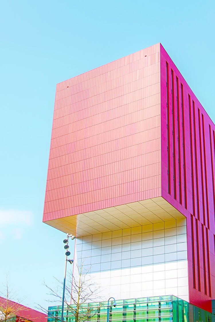
Image courtesy of Tony McAteer.
Editor’s comment: “Almost the color of candy, this building seems like it popped up from a futuristic fairy tale. Nice capture!”
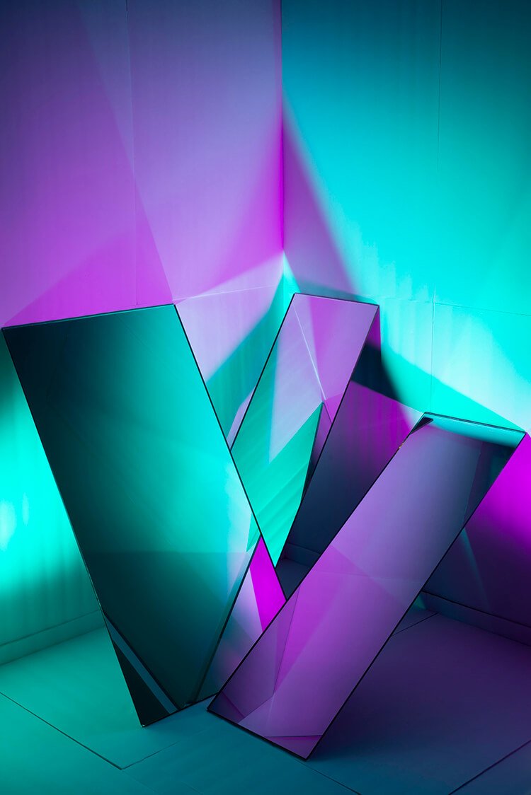
Image courtesy of Anton Kuehnhackl.
“I’m interested in the idea of deconstructing an image either visually, conceptually or compositionally.”
Instagram: @tontontontontontontontonton
Editor’s comment: “Here the combination of the teal and the magenta is so mesmerizing that it takes a while to see what’s really going on in the image. One desires to deconstruct the image while reveling in its color.”
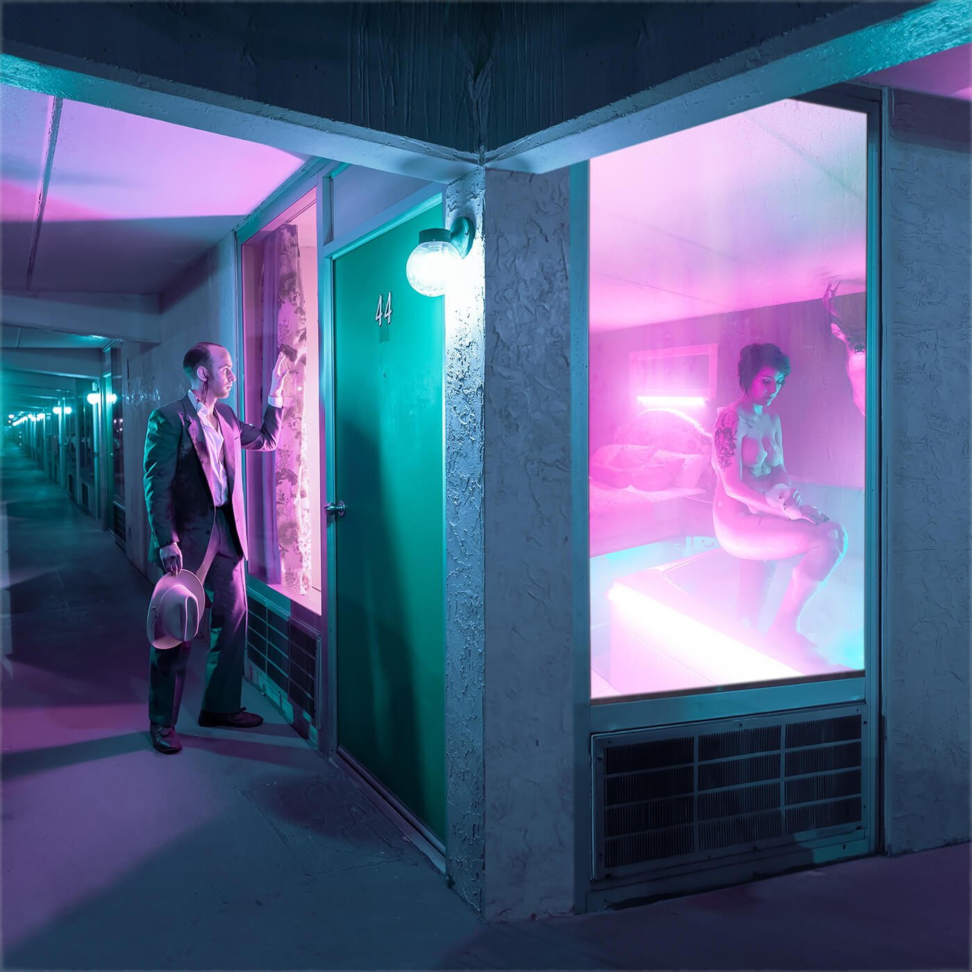
Image courtesy of Brandon Langley.
Editor’s comment: “Fantastic use of color as an aid in storytelling – the color here is central to the efficacy of the shot. There’s so much going on in this scene that the eye really wants to linger, but it’s the color and composition that grab our attention in the first place, emphasizing the strange, unsettling subject matter on display.”
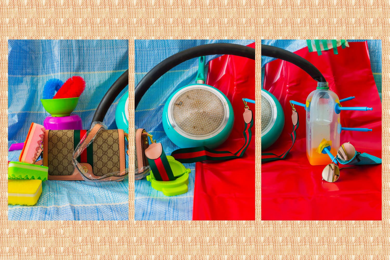
Image and text courtesy of Jules Perrenot.
“The photographs in this project were produced during a trip to Georgetown, Penang, Malaysia. All materials and items in the images, some obviously designed in North America or Europe, were produced in Asia and purchased on the island of Penang. Less than 500 Malaysian ringgits (120 USD) were spent in total to purchase the set and products. The project explores aspects of globalization. As a privileged tourist, even living as a student, I was able to experience living like the #1 simply by traveling to a place where my money would more powerfu.l In this dream-like setting it is easy to indulge, let go, forgetting the complex socioeconomic factors that enable our consumption – global marketing strategies, labor exploitation, exhaustion of resources, social dumping, growing inequalities to name a few. Pulling inspiration between fashion, product and still life photography my intent was to convey the tension between living in paradise and its consequences. Like the purchased items in the photographs suggest, I myself had a sip of Penang’s bliss. Rather than pointing fingers I wish for this project to acknowledge the situation and consider a better tomorrow.”
www.jules-fiction.com and Instagram: @jules-fiction
Editor’s comment: “Simple designs are often the most powerful. Here the photographer uses still life photography with bright, popping colors and palpable textures to illustrate “the tension between living in paradise and its consequences”. The colors and clean composition do an exemplary job of drawing us in.”
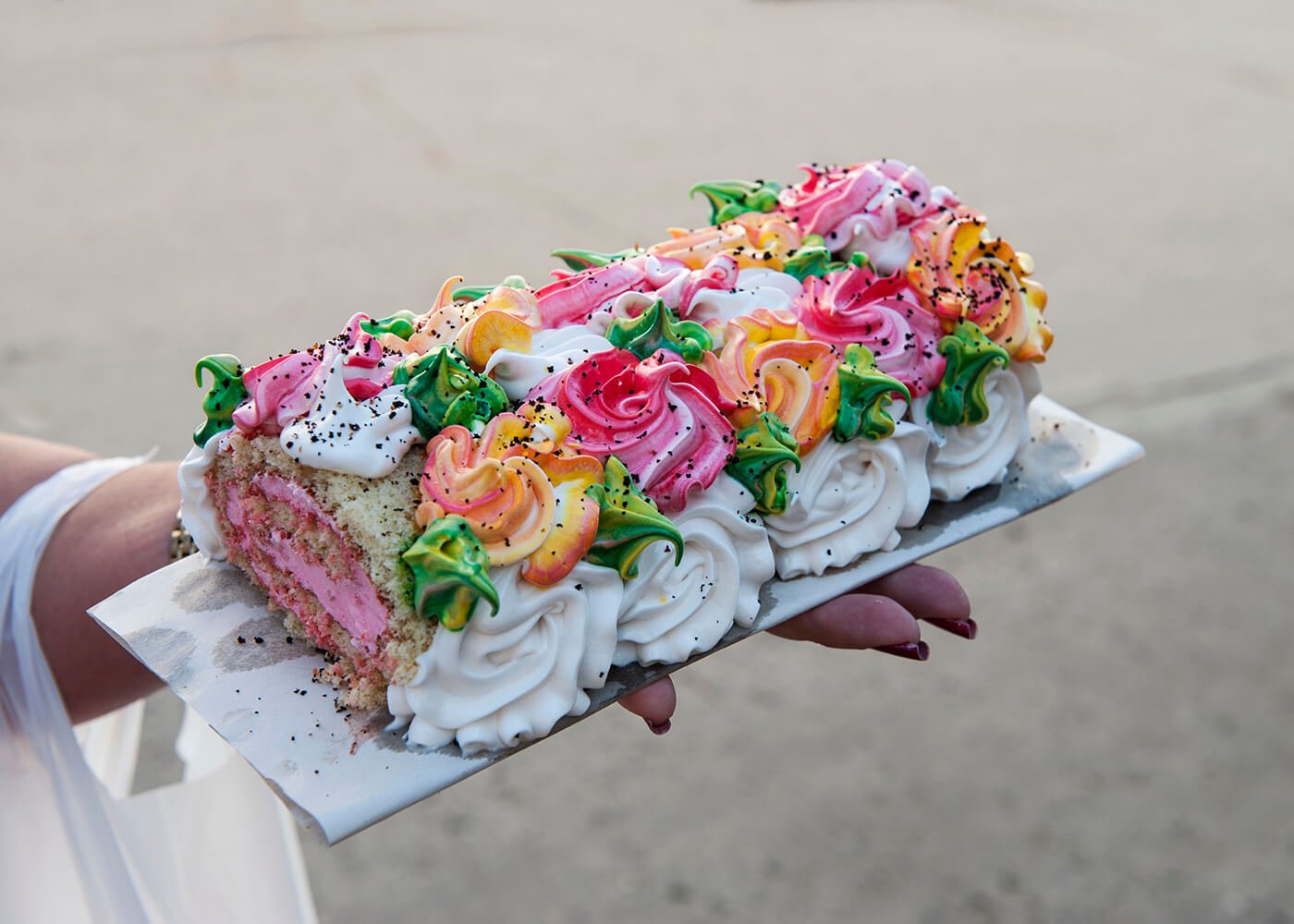
Image courtesy of Femke Dee.
www.femkedee.com and Instagram: @femkedee
Editor’s comment: “There’s more than just color in this image. The expression in the hand, the cut off slice in the front of the cake…the more one looks the more there is to find, despite the seeming simplicity of the shot.”
