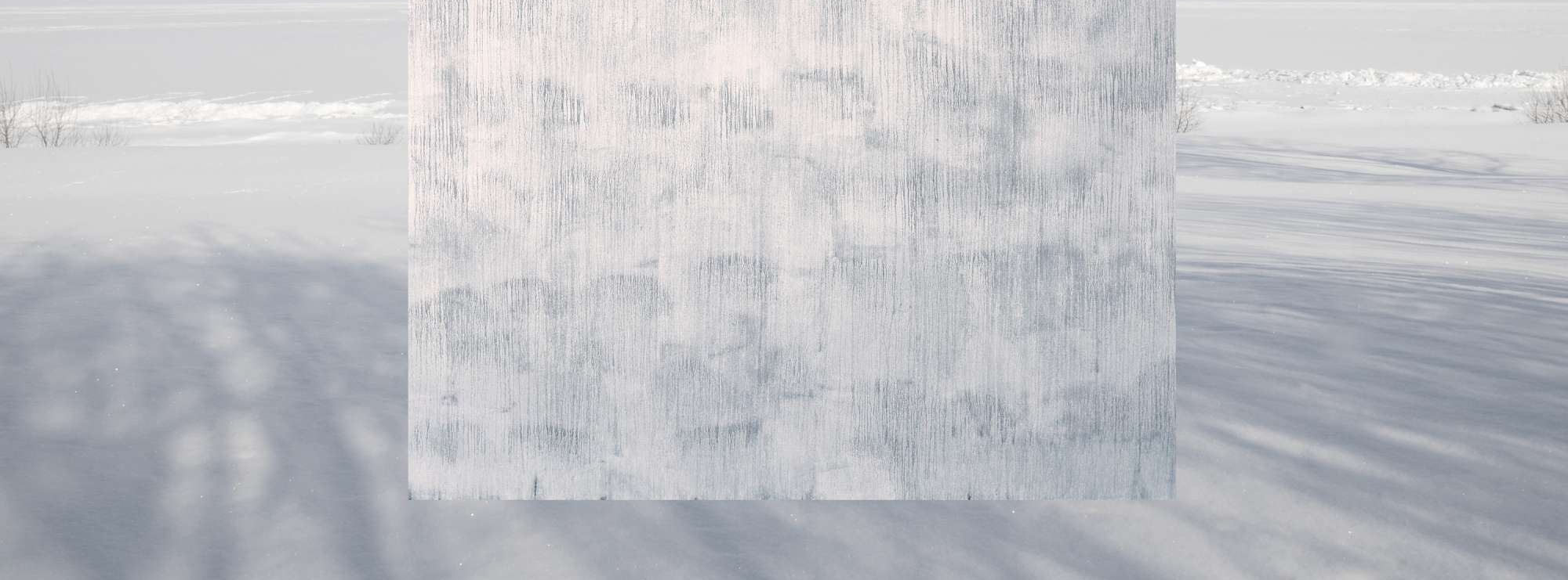
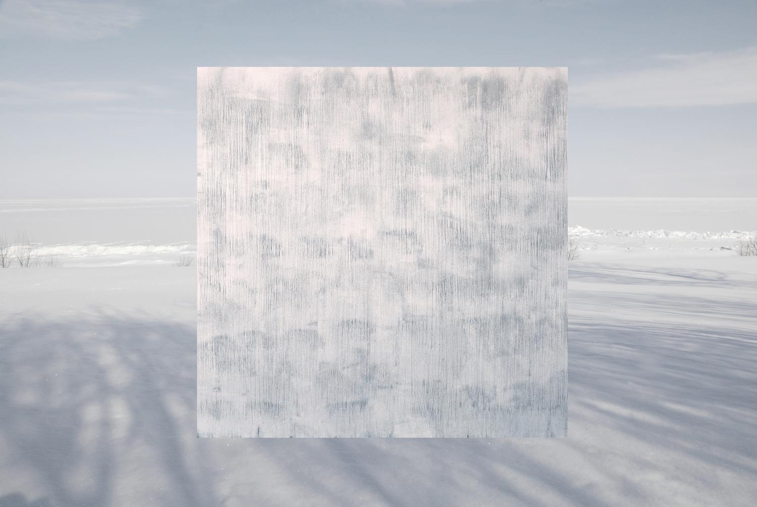
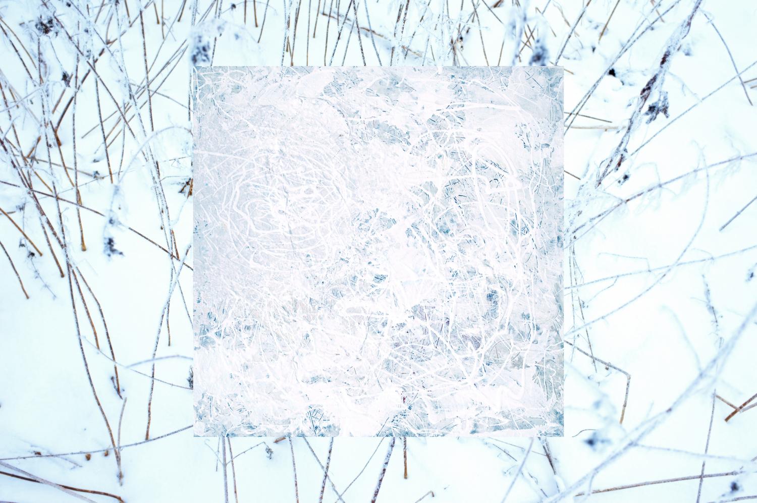
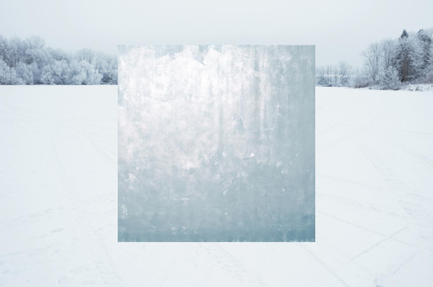
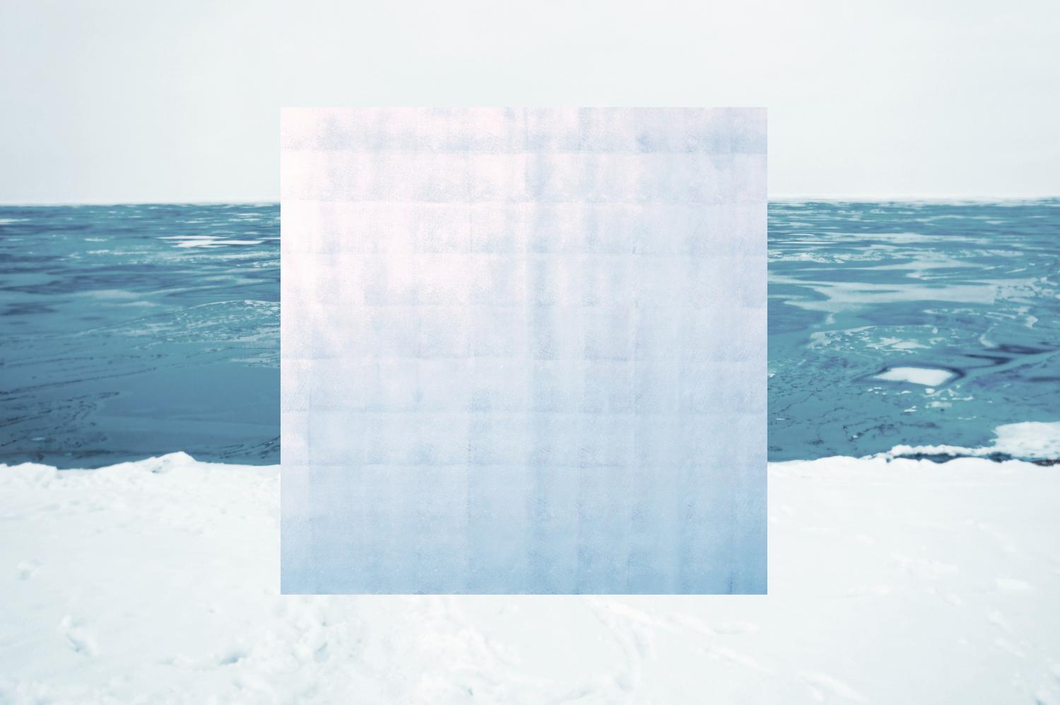
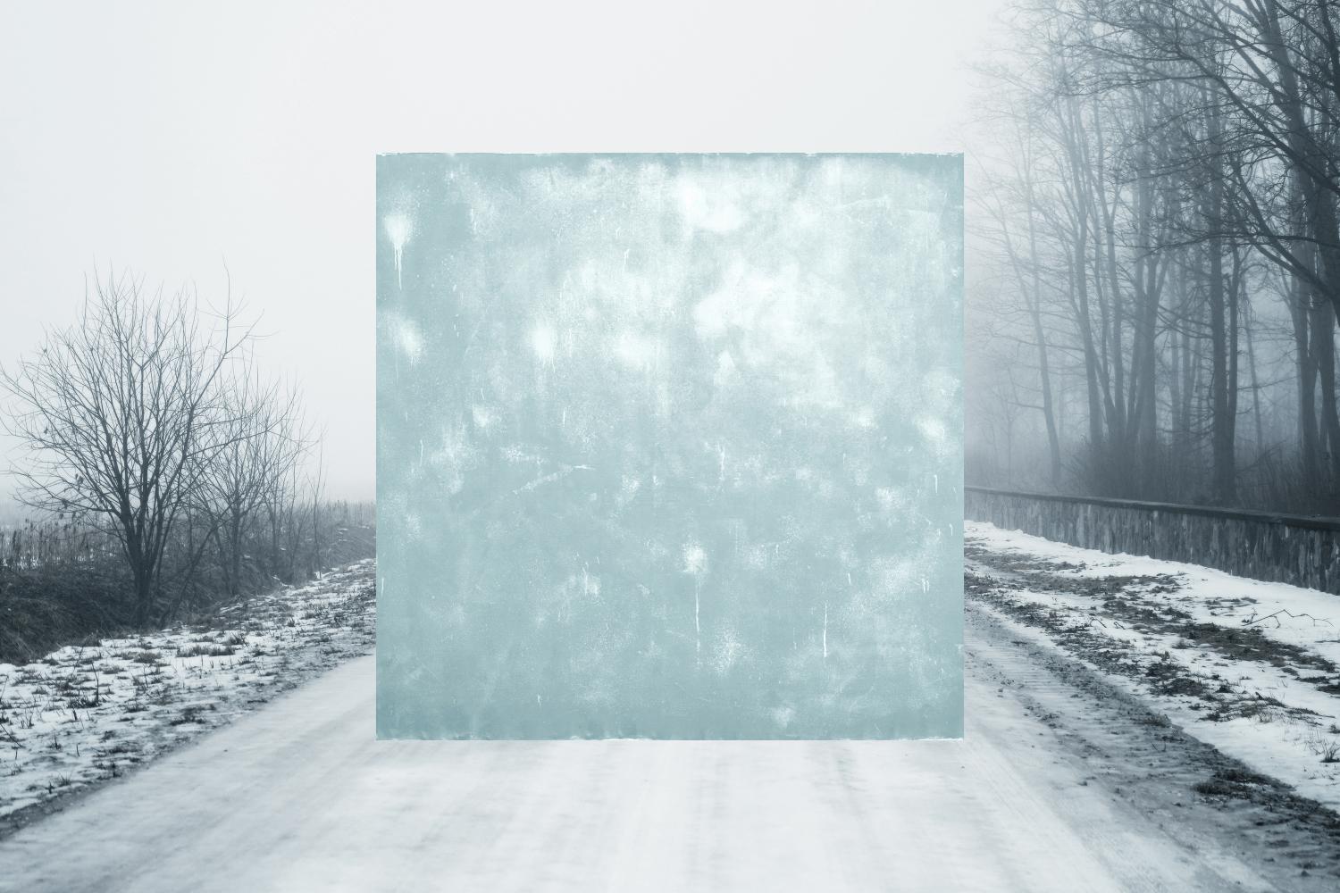
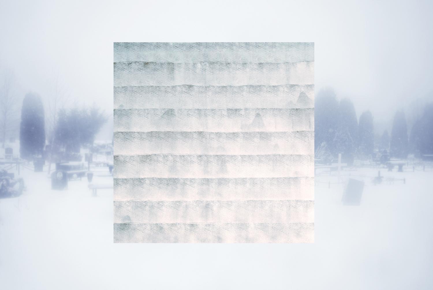
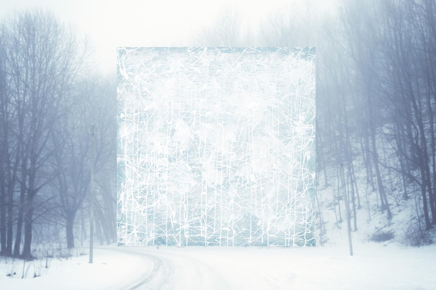
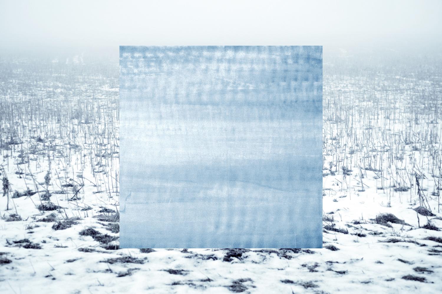
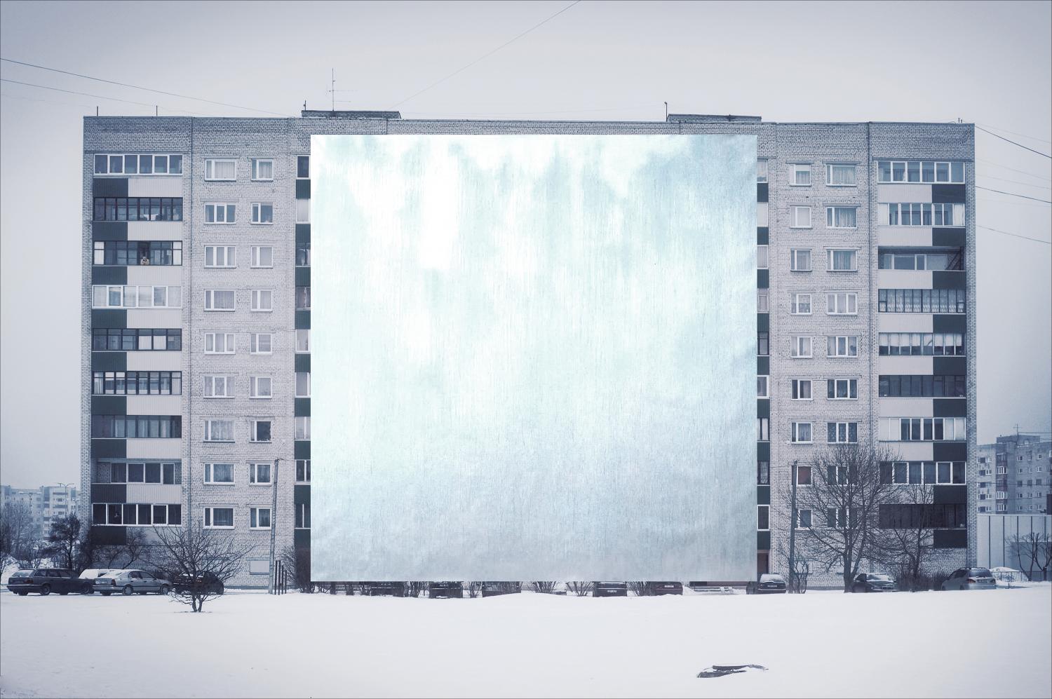
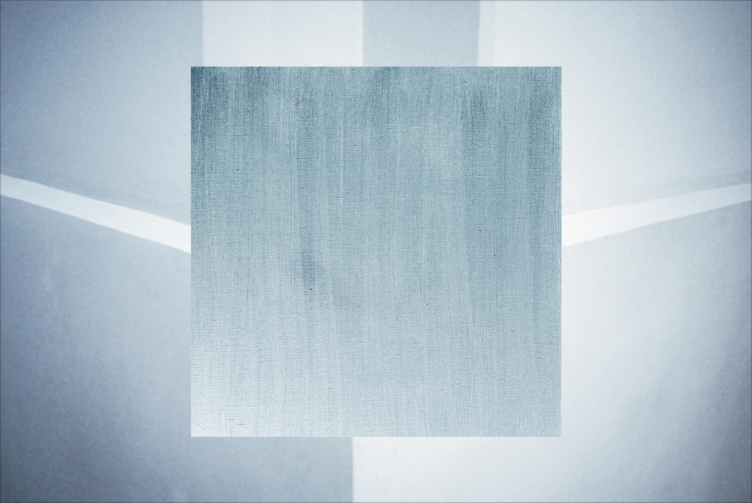
White on White
Exhibition photo art project "White on White". A journey of abstract paintings on the white expanses of being. Works are printed in meter size on the long side.
Minimalism in space. The similarity of the world with a fantasy world. The chill of white on white.
Trying to see multiple diversity in white. White is not just white. White is infinity. Photos of my abstract paintings on the background of landscapes.
Minimalism in space. The similarity of the world with a fantasy world. The chill of white on white.
Trying to see multiple diversity in white. White is not just white. White is infinity. Photos of my abstract paintings on the background of landscapes.
Photographer
Eduard Zentsik
Eduard Zentsik is a prolific Estonian-based artist of many faces. He’s developed radically different artistic personas, refusing to link his name to a single signature style, technique, or theme. Instead, Zentsik mixes genres and media and playfully subverts the traditions of old.
Painter, photographer, graphic artist, designer, author of installations, performances and musical improvisations. Organizer of youth exhibitions and projects. For over years of creativity had more than a hundred personal exhibitions and took part in numerous joint projects. Participant and winner of international Photographic and Art competitions. Numerous works are in private collections around the world.
Feedback:
My overall impression is that your work is very strong, well-formed and cohesive. It’s engaging, absorbing and playful, and you exhibit a clear technical ability alongside adeptness for storytelling and art. It’s the type of work that has an immediate visual draw, but then offers elements that slowly reveal themselves and linger, and that’s a powerful combination. It’s the type of work that I return to with anticipation.
Let’s start in detail with your artist statement. While your images should speak for themselves, an artist statement is something that many photographers overlook, or hastily pen before sending their finished work out for review. I encourage all photographers to put the same care into crafting a statement as their photographic work.
I don’t feel like your statement does your work justice.
It’s too cumbersome and confusing. While statements can be poetic, unless written extremely well they can come across as pretentious or awkward. I would encourage you to try to write something more straightforward and less metaphorical. Avoid jargon and convoluted or flowery language unless it has a specific role. Also, don’t give technical details. It’s your opportunity to plant seeds in the viewer’s mind, to offer contextual background, or hints towards understanding your work’s meaning – perhaps the more unusual or important aspects. You want your viewers to engage with your work on their own terms, but you also want to give them an upfront opportunity to care. It also helps to add a splash of your personality and use the first person.
Perhaps it’s something you could explore in discussion with a fellow photographer, a passionate friend, or even better, an editor or critic? Engaging in a dialogue may help you hone in on what you really want, or need to say.
Moving on to subject matter and viewpoint, or in other words the overall thematic impression of your work, your work is strong in both regards – an interesting perspective on a fascinating subject. I feel like I’m diving into a white world with you, and I can feel your personality as a photographer shining through. It is clear that you have engaged with the subject deeply. This is no mean feat – it can be harder to find something new in areas that many photographers have already trodden – and so I admire it hugely.
Technique is of course fundamental, and a cover-all term for a range of elements – composition, framing and focal point, use of lines, perspective, layers and negative space, exposure, sharpness, depth of field and so on and so on. Like all good art, there are no hard and fast rules for what’s right or wrong, but that doesn’t negate the need for a general level of proficiency, and generally the best photographers know which rules they’re breaking.
You exhibit a fantastic technique which is a joy to review. High-key photography isn’t easy, but your images are fascinating.
Your style of composition is simple and artful. I’m particularly drawn to image 7 for example where the elements combine effortlessly.
You display a real command of your camera, but there’s a level of uniqueness and personal style that shines through too. I feel like a particular photographer took these pictures, rather than any photographer.
You employ fantastic use of light and shadow – each image has all the details it needs to catch the viewer’s attention.
Post-processing can be divisive, but your use of it is elegant and strengthens each image, rather than overpowering them.
Well done!
And finally on to image sequencing and editing, which although I’m discussing last, is something often overlooked but fundamental to the ways in which your work will be interpreted by the viewer. By carefully considering the order in which your images are viewed you guide the viewer on a journey – perhaps a chronological one, or one that ebbs and flows, or one that’s jarring. It’s a subtle, but powerful tool for influencing how a viewer interacts with your work.
I think further consideration is needed. While you may or may not have started about sequencing and editing, it strikes me as something you should reflect on more deeply.
There’s no clear narrative or flow from image to image. How do you wish to guide the viewer, and what rhythm do you want to create? I don’t get a sense that this has been considered. For example, you may wish to take images that are visually similar (e.g. images with forests or images with fields) and space them out across the visual journey. Or you may wish to start the viewers in one place (for example, inside the city) and leave them somewhere totally different (in the middle of the nature).
You may also want to think about initial and final impact. Or in other words, starting and ending with your best images in order to make your viewer want to see more from the start, and leave them with a strong impression at the end. I feel that images 2 and 7 are the strongest – if you agree, think carefully about where you position them.
Thanks so much for sharing your work with me. It’s a privilege to be able to review photographers’ work, and I thoroughly enjoyed getting to know yours. You have a very impressive and rounded body of work, and so there were few areas in which I could provide real constructive criticism. Nonetheless, I hope you found my thoughts to be valuable, and I hope it provides you with some ideas on which to reflect. You’re producing some fantastic work, so keep it up!
life_framer
COLORS – We’re delighted to announce the winners from our seventh theme of this edition, judged by Marion Tandé - Manager of the Department of Photography at MoMA, New York.
•
Honorary Mention by Eduard Zentsik (@photo_zentsik).
•
Life Framer comment - "An amusing slice of life, with the bright primary colors of the ponchos filling the frame at odds with the boredom of the spectators as they wait out the rain for the sport to recommence. By turning his lens away from the action (or here lack of it) and towards the audience, Eduard gives us a frame full of expressions to pour over."
This user account status is Approved